to be honest erpnext really needs to work on the UI , ERPNext cannot stand presentation where odoo have been presented or any other software because at the end of the day the user will actually buy UI because both of them offers same functionality . ERPNext have done a good job now improving the UI should not be an issue
I think, if we changed the home page of the app with the design of FRAPPE v11, will be really a good UI.
I’ll work on it.
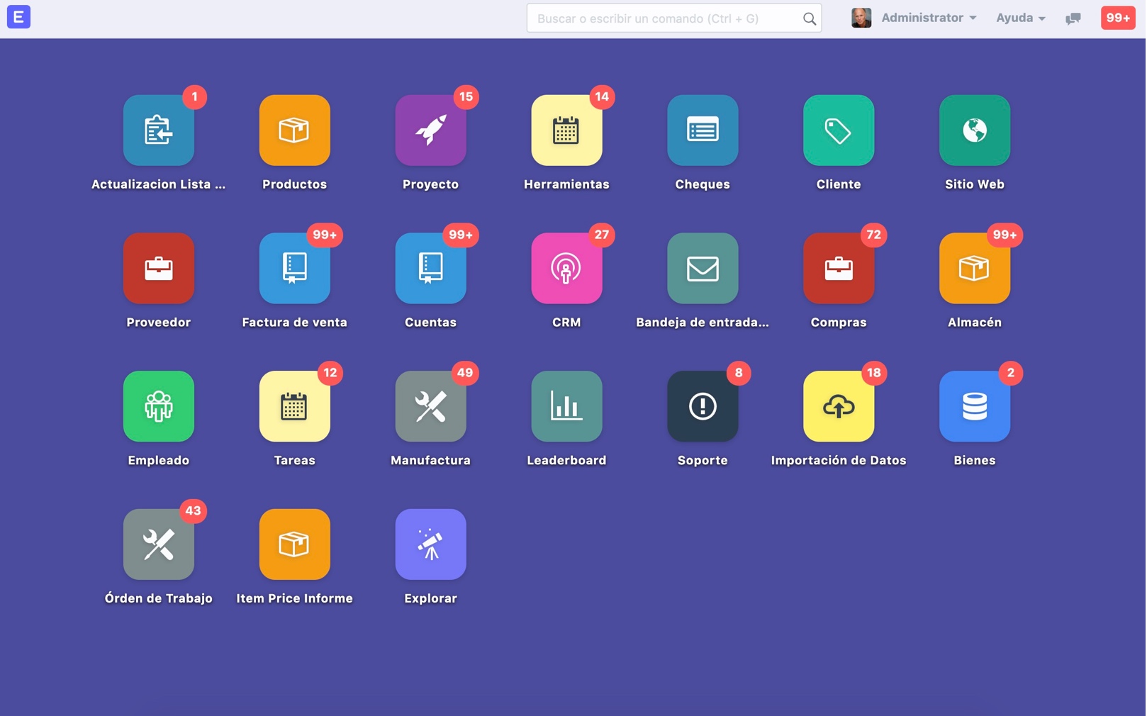
yeah very true because what we have currently is like plain excel sheet
To me, a start would be a published style guide. This would specify the defaults in terms of typography, color, spacing etc. These could be over-ridden but at least we would know what we were over-riding instead of groping in the dark
See for example the shoelace.style style guide Color Tokens (color tokens)]
I’ve mentionned shoelace a few times in these forums. They were recently acquired by font awesome, who are going to preserve the open-source nature, and re-brand to “web awesome”. I have no relationship with shoelace (I am not on commission ![]() ) but they just set some really smart ways of doing things, and in a way becoming a bit of a global best practice perhaps
) but they just set some really smart ways of doing things, and in a way becoming a bit of a global best practice perhaps
2 Likes
… and dropping some thoughts on this before I move on to other things. I think ERP next can be styled with only 7 colors:
- top navbar background. This will depend on preference e.g. if a company has a blue logo they are not going to want a blue navbar. Suggest to default to a mid grey
- left menu and page background. If you look at shoelace.style the left hand menu is a very light grey. This is almost imperceptible, but does add a little differentiation
- primary color. suggest shoelace button default (blue). Goes to a lighter blue on hover. This for the primary action button, and also the border around text boxes and drop downs when they are clicked into (these should of course be white not grey!)
- secondary color for buttons. Suggest the shoelace default button (white with a grey outline - goes light blue on hover)
- secondary color. Where needed e.g. to add a little accent. The grey that appears on the neutral shoelace button.
- Heading color. Default to black or a very dark grey
- default background color. This is the background of menu bars etc. Suggest a light grey (as per the current ERP Next color)
This will give a very neutral palette that is still better than the current UI which is basically just monochrome. And these seven colors can then be easily over-ridden according to preference
My 2c on it if it helps anyone ![]()
3 Likes
is there anyone here who had succefully installed this app for odoo like theme
let me know on how to start this? I have the same requirement from the client on v14
just message me if we can colaborate on this!
Once again, well done @tazi.said.
Per functionality and customization, I prefer ERPNext over Odoo. But like you mentioned above, flexibility and user preference also matter.
God bless and good success to you.