Yeah you’re right and that’s exactly the kind of confusion I am talking about in that post. There needs to be clarity about system objects and how they’re represented in the UI.
May be not.
What does it matter for a end user/business person if he just clicked in a doctype or a module unless it is getting the work done with ease.
At the end of the day, what matters is “if you can sell it”. May be home screen is better as you drew - a mix of modules and apps and doctypes.
App like Drive, CRM - it is self sufficient. Place their icons on home screen.
Apps like ERPNext has multiple modules - ERPNext is nothing but a name for collection of these modules. So, why not just place icons of mostly used modules ? Also let users choose which icons to show there.
Doctypes like Project, User, are another big thing. Lets keep their icons, clicking on them will open doctype inside their respective modules.
In separating Apps and Modules in the workspace, may be place two kind of side bar. Let me explain:
(ignore the icons)
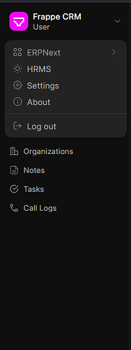
There can be two menus. To the back will be specific to the module/app.
Another one to the front (accessible via drop down beside app name) should show app names and allow navigating to modules/doctypes.
We can make the app dropdown as apps switcher and if possible make navigation to modules with in app via drop down menus.
For most enterprise-level customers, this matters to their internal IT teams for technical vetting and approvals.
Alright ![]()
I think that’s why the shift shown here is important. At a technical level, I think Frappe has always been a bit unsure about what modules are. They’re not really relevant at an API level, and they’ve tended not to be very visible to end users. They’ve had permissions implications at some points, but I don’t think they were ever well suited to that purpose.
Here, modules are being asserted as semantic categories in the UI. This makes a lot of sense, and it takes that role away from the word “app” (which already has too many jobs).
Yes I agree to this part and I think this needs to be implemented in the correct way with the upcoming v16 changes to avoid adding any further confusion between Apps and Modules.
Traditionally, the unsaid hierarchy in Frappe has been something like this:
Apps → Modules → DocTypes
In short:
- A DocType belonged to a Module
- A Module belonged to an App
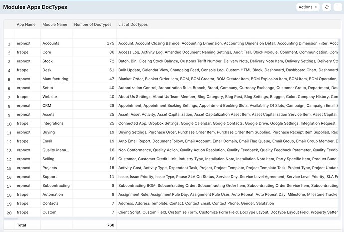
I’ve created this custom report to show this hierarchy ![]()
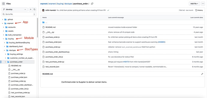
Now this hierarchy can also be seen in the app directory structure like this ![]()
This is all great at backend and developer level but in the frontend UI this hierarchy seems to be very blurry. There is no clear way to easily distinguish between what’s an app, what’s a module, what’s a DocType. Now with the v16 home screen demo, this might add to the confusion when we’re trying to show around the system to an end user.
Again, I reiterate that this can be easy to grasp from the dev perspective, but very difficult from the business user perspective who has to quickly navigate around different parts of the system while working in it. In my opinion, the end user needs to have at least a rough mental map of where exactly he is within the system to be able to navigate it with ease.
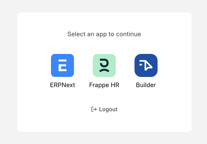
Also, currently we do have an app switcher which looks something like this ![]()
This app switcher can be accessed in v15 by clicking on the profile icon in top right corner → Apps. I am not sure what happens to this app switcher now once we have the new home screen in v16 because app icons are now a part of that new home screen alongside icons for modules and doctypes.
To summarize:
- First, the UI needs to be made more friendly in terms of distinguishing these system objects (Apps & Modules) and having at least some form of structure / hierarchy to them
- Second, the UX needs to have a consistent way of navigating the system (Sidebars & Workspaces & Awesome Bar)
I don’t share your take on this.
In v15, modules barely exist. Where would end users even be encountering them to be confused about them? The whole problem Rushabh’s pointing out (accurately, in my opinion) is that until now there has been effectively no hierarchy at all.
In v16, you are interpreting the demo launcher image to combine together four different kinds of entities: Workspaces, Modules, Apps, and DocTypes. I would be more inclined to interpret that screenshot as showing only one entity type: Modules.
Yep it’s modules effectively. ERPNext and Frappe framework just happen to have multiple modules in them, but apps like CRM/Helpdesk/Gameplan/Raven are usually just one “module”. So it’s effectively a module selector/switcher.
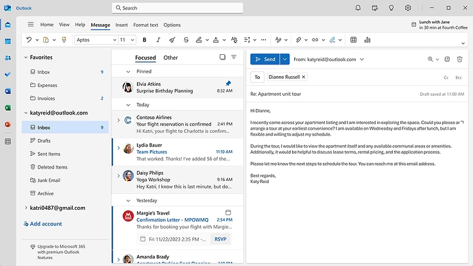
Understandably there seems to be some fear without knowing what changes are actually forthcoming… Understandably it impacts the workflow and if users have to switch back to a module selector before diving back in - it could have negative UX implications. I suggest we propose solutions or ideas… I suggest to take inspiration from what Microsoft did with Outlook (new 365 interface) - see the attached screenshot. They have a thin “app selector” column to the left and then followed by the associated modules within the app or links (in their case email id with folders)… Excited that v16 will have the ability to switch between modules instead of having to type new URL or use awesome bar to find doctype links… My two cents…
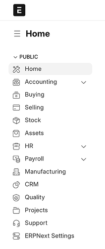
I think, the sidebar in v15 is essentially based on Modules. They’re named exactly like the module names in the ERPNext app like Accounting, Selling, Buying, Stock, etc. The technical term of course is “Workspaces” but on a conceptual level (from end user POV) those workspaces are acting as Modules thereby assisting the user in navigating the system in a relative way.
Again, this is subject to interpretation - which is my main point. There is no definite structure in the UI. You said you are more inclined to interpret the icons in that screenshot as Modules but then why not as Apps when that is a more visible / relevant term from the user POV and now that everything in Frappe in an app?
See that’s the thing again, we know those are modules but then there are even Apps in there like CRM, HRMS, etc. (even though they’re just single module apps). Also, what happens to the current App switcher we have in v15? That’s still called an “App Switcher” right? Even though those apps are just single module apps?
This is the current app switcher in v15 and it clearly says select an “app” to continue. Now even though those apps might have just one module but it’s still an app that we’re switching to.
The terminology is confusing and this makes the navigation confusing. Adding everything on the home screen as icons will add to the confusion.
In my honest opinion, when the user clicks an icon on the home screen, he/she has to know what exactly is he clicking (Module / App / Workspace / DocType) and what to expect on the next screen when it opens.
I think in the future, what I can see happening is that every module in the ERPNext app is broken down as an app by itself. Eg: Selling, Accounting, Stock, etc. all of these current modules will eventually become installable apps. I understand that this has been the direction ever since the decision to break down the monolith was taken. Once that point is reached, I assume everything in the frontend will be “apps” for the end user. Until that point I think this confusion will continue to be prevalent.
Nevertheless, I just wanted to share my inputs and opinions about the new v16 home screen and the workspaces demo. Like everyone here, I am hoping that it turns out to be a great version.
I absolutely agree on this part. There couldn’t have been a better example of switching between apps. When we click on the “Drive” icon we know what to expect - there will be a sidebar (showing menu items specific to that app) and a list/grid view. This type of app switching is very intuitive in terms of navigation and used widely across many large systems and ERPs.
You’re extrapolating a lot from a couple of screenshots. This is a mockup of some concepts being explored, not technical documentation of a finished product. The fact that the underlying structure is not clear to you or me does not mean that it does not exist.
Bottom line, this is good news. You’re saying that the v15 UI does not provide sufficient semantic structure. The CEO of Frappe Tech devoted 100% of his 7 minute presentation to saying exactly the same thing.
The demo and the couple of screenshots are everything we got right now to discuss. I never said it’s a finished product or the official technical documentation. Also now that you say it, I am wondering if the demo was just a mockup of concepts being explored or actual screenshots of the v16 home screen work in progress.
All I am suggesting is that we need to have a better UX to make the system more navigation friendly but the home screen screenshot / mockup shown by Rushabh during the demo raised a bit of concern in my mind which I felt like sharing here in the community and spark discussions for the better.
Looks like V16 is not yet ready. So I will have to post my POV.
During V11, when ERPNext was transitioning into a more classical desk, I was one of the minority voices that aired that it was a wrong move. Since at that time I saw the split of Tryton away from Oddo, it maintains the classical desktop approach. But Tryton has a good reason because it really provides physical desktop applications while ERPNext does not.
Our core developers now realize that maintaining the icons is really the future. I can just imagine how much workload they have in order to release V16 as most of us expect that it is the more stable version of V15. That is not the case now.
What will be included in the desktop icons? Here is my basis of what I am thinking before answering what they will be. In most enterprise ERP publications, we can read 2 kinds of modules: horizontal and vertical. Modules that are used in any of the business domains are called horizontal. While modules that is in a specific business domain are called vertical.
And, take note of these, the concept of having several apps in one site is ridiculous and believe me it can create more unnecessary confusions than good. One site, one app no matter how many horizontal and vertical modules installed under the hood. Remember the beauty of ERP framework is that developers create more and more modules for service providers to use and assemble them into end-user workflow.
What will be included in the desktop icons: Module and Workspace! Think about that. It is plain and simple. It will definitely provide all the end user needs.
Thanks for all the feedback. Just laying out the broad principles here:
- Consistency with the new frappe-ui apps like CRM
- Icons will be made consistent - they are place holders right now
- Sadly Modules have never been “first class” in Frappe - the new layout will be linked with Workspaces - which offer more flexibility.
/appswill be merged with the new desktop - maybe bring back/deskas the landing page for desk
- Everything will be heavily tested and polished. We won’t release officially till we do that.
- We will start merging soon.
@rmehta Will the new desk be based on Vue + frappe-ui?
Good to know that we’re steadily moving towards a single UI framework for all apps across the system! Looking forward to that ![]()
Okay so just for further understanding, the icons on the new desktop will be for workspaces only and not directly linked to any apps or modules correct? If that is the case then it will be much easier to navigate the system as compared to placing icons for everything (apps, modules, workspaces, doctypes) on the new desk.
![]()
![]()
![]()
So the current app switcher in v15 will be retired?
Okay great to know that! Better to postpone the release and prioritize stability ![]()
It would be great to support standard Openapi on api level and “foreign keys” on database level. I’ve heard about performance argument for mariadb, but frappe support not only Mariadb but Postgres too, so it could be much of use.
Documenting solution from “Commit” is nice and handy, BUT there’s standard instruments, not talking about consistency on database level.
I’ve heard about Sqlalchemy plans, yes it about standards too)
It would be useful to concentrate on implementing difficult bussiness logic, simplify interface(making hard logic simpler), optimize performance (performance is feature, as chrome said) and not reinvent the wheel.
Vue is nice foundation but there are another parts that can be standardized.
Postgres is nice database(great foundation)- ignoring embedded functionality leads to errors and inevitable replication of existing relational logic and constraints.
This is perfectly understandable because ERPNext was designed as a monolith in the beginning, and we appreciate the stability this architecture provides.
Now I am starting to get feelings like Joey had when Chandler said they would switch back the room once the girls go to work the next day.
“Nah !!”
I don’t know what I want ! Lets just wait until the maintainers release a version.
![]()
I am happy now with V14 because I came from old and minimalist systems. What I am hoping that developers will strike the balance when they remove the V12 iconic menu from avid users. One can notice this when presenting ERPNext to a potential client, more than half of them draw their attention to the desk icons.
How about during database set-up, you will be ask if what menu you like: iconic or minimalist. Your answer then defines your landing page.
