Some thoughts
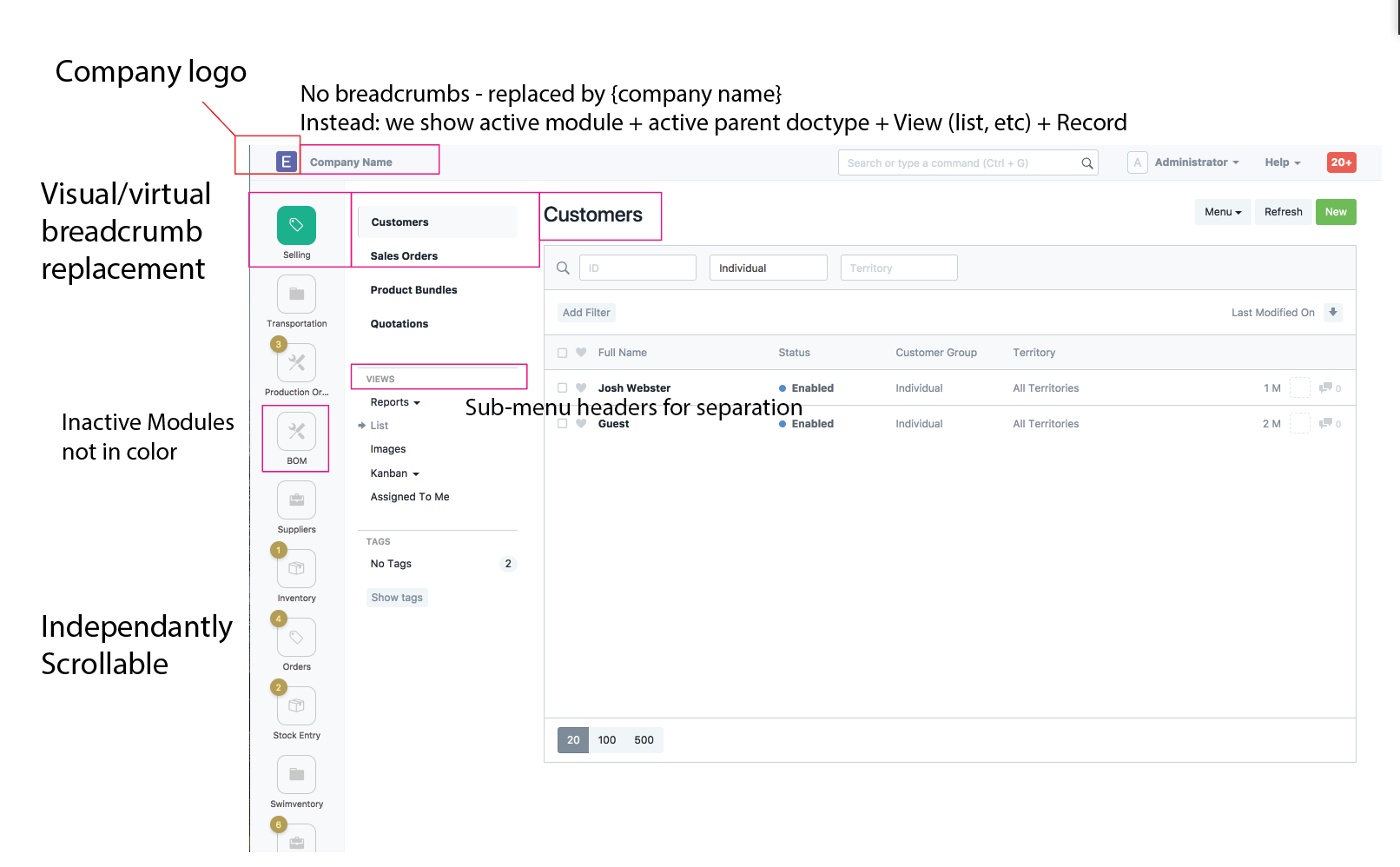
- Simplify the list of menus on the left side. There isn’t really a need to use the rounded square design anymore in that context. Just retain the octicon/fontawesome icon and the module name. Thats what most other apps do these days.
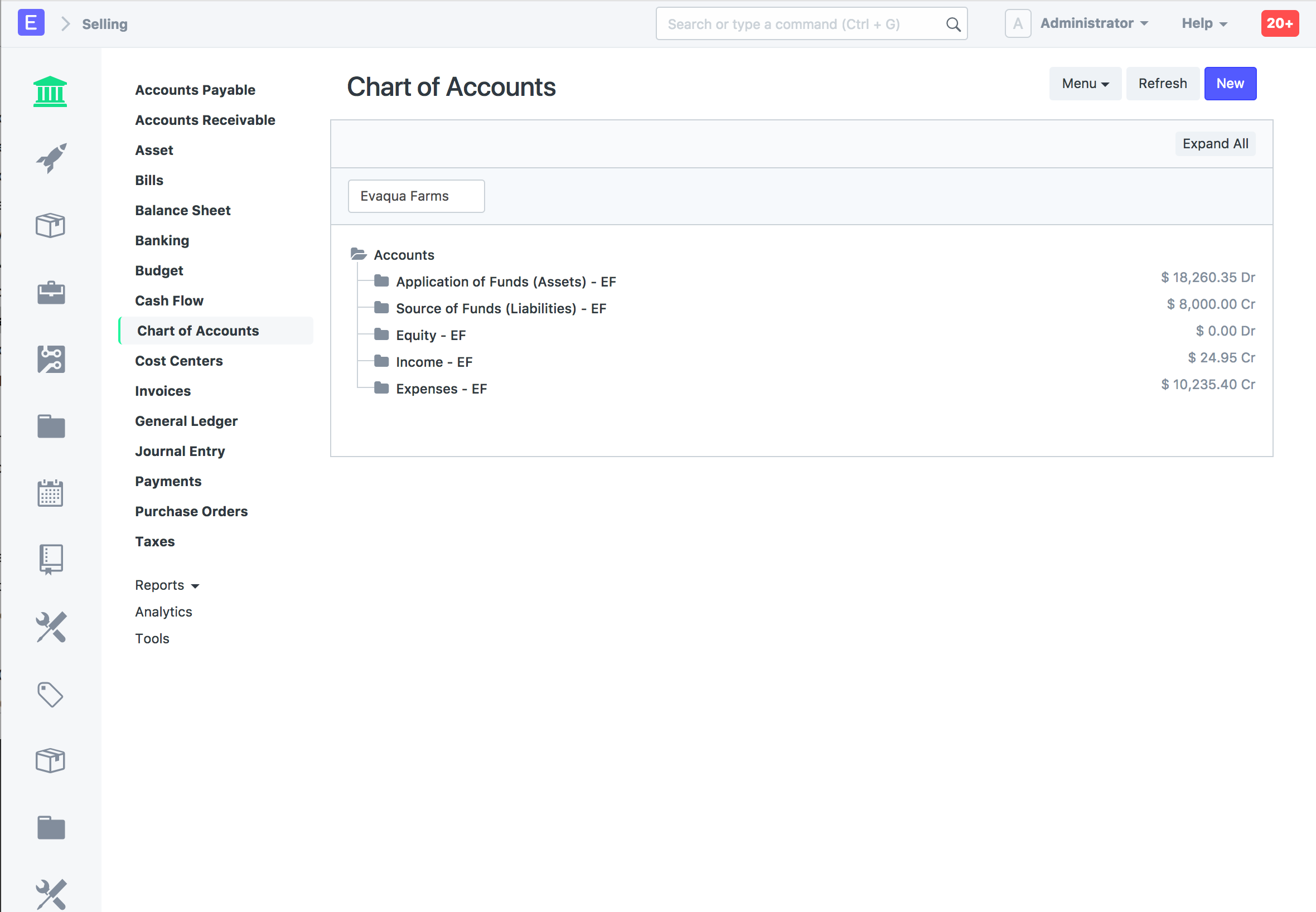
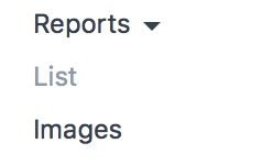
- The “selected module non-child doctypes” section won’t scale. Looking at the accounts module right now, there are 30+ links - where are those supposed to go in this new proposed navigation? I see the ideas of lumping things into reports and so on, but that also has limited scalability.
- In my opinion, a viable proposed first cut of this would be the following
A. Remove the “desk” - that’s basically a glorified list of links/bookmarks honestly.
B. Module navigation takes place using a bar on the left side, as proposed in the mockups
C. Add a Viewport to take advantage of higher-res monitors (Fill screen width to show more columns, and more discussions in the forum) - in the initial release, make this possible, but each module would retain the current “2 column” view until they can be reworked.
D. Modify slickgrid or the new FrappeGrid component to be full-screen in the new viewport
E. Keep everything else the same for now. Iteratively work on wider module viewports until that task is complete.
 ==>
==>