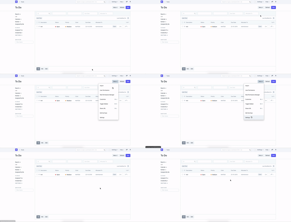
As a User, I would want to be able to customize the list-view to my personal needs and improve the UI by adding some visual navigation elements.
Each numbered is visually referenced in the attached image.
- Be able to adjust number of columns e.g. more than 5 columns as of now.
- Make primary row adjustable: I want to be able to decide, which data is the primary row: either title or name or id or etc.
- Only the text in the first row should be a link, not the whole row. This can lead to unintended opening of the entry.
- Row width should be individually adjustable for every DocType.
- Make rows sortable by clicking on table head. If a sort is already active, because the user has already sorted by clicking on the row, the next sort should be a combination of current sorting result and last filter. e.g. first I’ve sorted by ID, then by name. The name sort should take the first sort-property as a primary weight.
- Ability to disable and enable ID/Comments/Assignee Field/Status display. If you have disabled it, the new space should be usable by the other columns.
- Pagination (Page 1, 2, 3 … 10). This is not vital. It is just a different approach of showing results.
- Update List after entry created automatically. Currently, we have to refresh to see new entry.
- Bug: When new entry is created via API and you look at the list-view, entries are added and showing more result that chosen in the results setting e.g. 20 | 50 | 200
We have chosen 20 results as settings, but due to the update, 23 entries are visible. This should be updated automatically.
Feature: Feature: Better UI for List-View: More Space, Customize Column Width & more · Issue #8624 · frappe/frappe · GitHub
Bug: Bug: List View Update is displayed wrong · Issue #8623 · frappe/frappe · GitHub


