I can give it a chance but users will not even try.
Explanation below.
Screen 1
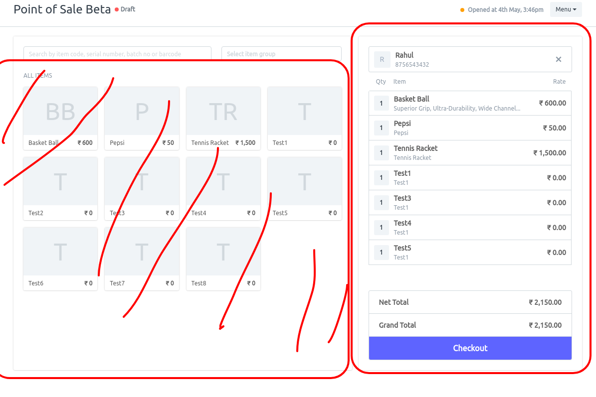
From the view it looks like 60% is given to the item area, only used to search items. Mostly done using barcode scanning very few users will use typing name and searching by image.
Image view only for restaurant is useful.
Button 1 = Checkout
Once I add 1 item to the cart it give me the below screen
Screen 2
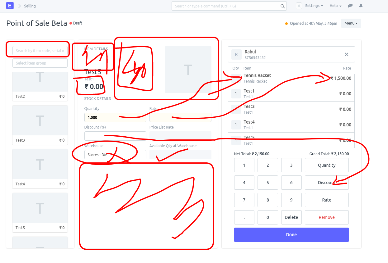
Scanning field position changed… user will have to click again on the field to scan the item?? We customised this to highlight scan field in our custom app.
- Fields are duplicated - Almost all fields are duplicated. Qty , Discount, Item name, Rate Item image was already present in the first view.
- Waste of space
Button 2 = Done , also needed to press it to add more items to the cart.
When I press Done then the Screen Moves back to Screen 1 ? why so much transition in UI data position?
Screen 3
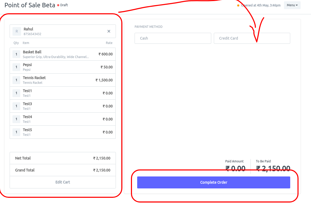
Cart switched from right too left, I understand you needed to bring payment screen on the right as most users will be right handed but why waste so much of space and use another screen when you can use this screen to close the invoice and print???
**Button 3 ** = Complete Order
Screen 4
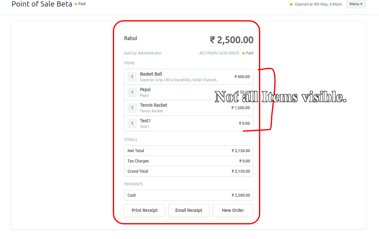
Another screen for no reason at all ??? also only showing limited items ?
Same data from the previous screen once again?
Button 4 = Used for Review and Print or New Order? and also after either Print or Email receipt user still have to press New order to come back to the new cart?
Total Buttons to press for single transaction = 5 without any changes does to increase/decrease qty or price change for the items.
We tried to to get an invoice closed in 4 button(Done is needed twice) after clients kept complaining on pressing 4 times.
Add items to cart
- Pay Now.
- Submit and Print.
- New Order ( We couldn’t overwrite this yet, otherwise we would have done it )
I see duplicate data and screen. From my point of view I think the whole process can be reduced to 2 screens and 2 buttons or 3 buttons max. While using the JS overlay for item details if needed.
I think @nextchamp.saqib should do some more research on POS design and practical use case before working on POS UI or else you’re wasting your time even though you have did an amazing work with the UI but consider practical point of view also.