Hello ERPNext users,
For the past few months I have been refactoring ERPNext Point of Sale (online). The goal of the refactoring was to make the transactions faster to meet the POS needs.
The plan was to:
- Make an intermediate invoice while transacting with the POS UI. Named POS Invoice.
- POS Invoices will be consolidated / merged into a Sales Invoice at the time of closing.
- POS Invoices will not affect accounting or stock ledger.
- At the time of consolidation, the combined accounting & stock ledger entries will be made.
- The consolidated Sales Invoice will contain all the items purchased by a customer in a day. Or between opening and closing period.
The said process has now been implemented and with a new UI as well. Now it needs to be tested thoroughly to have it merged and released in the ERPNext version 13.
Changes
-
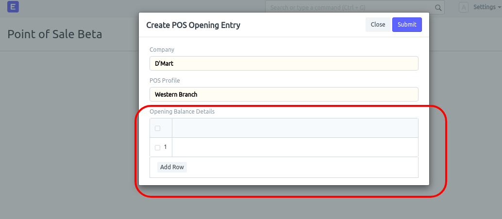
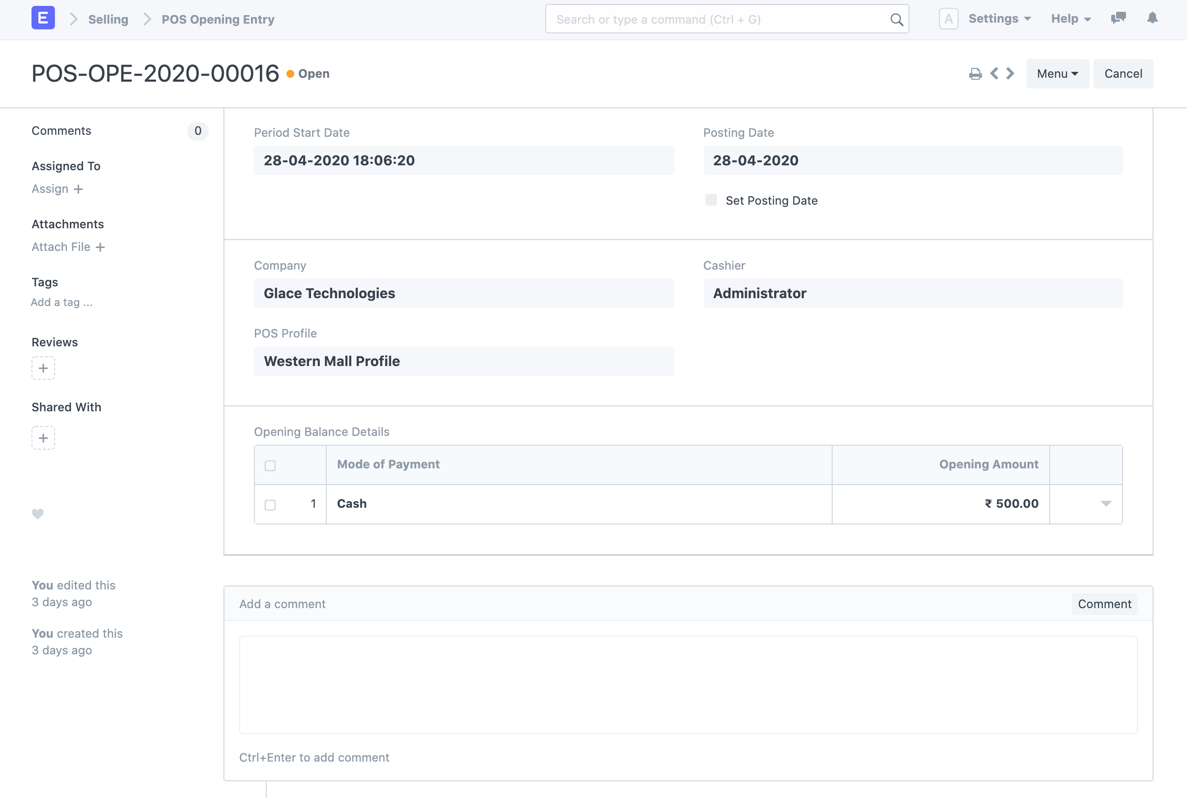
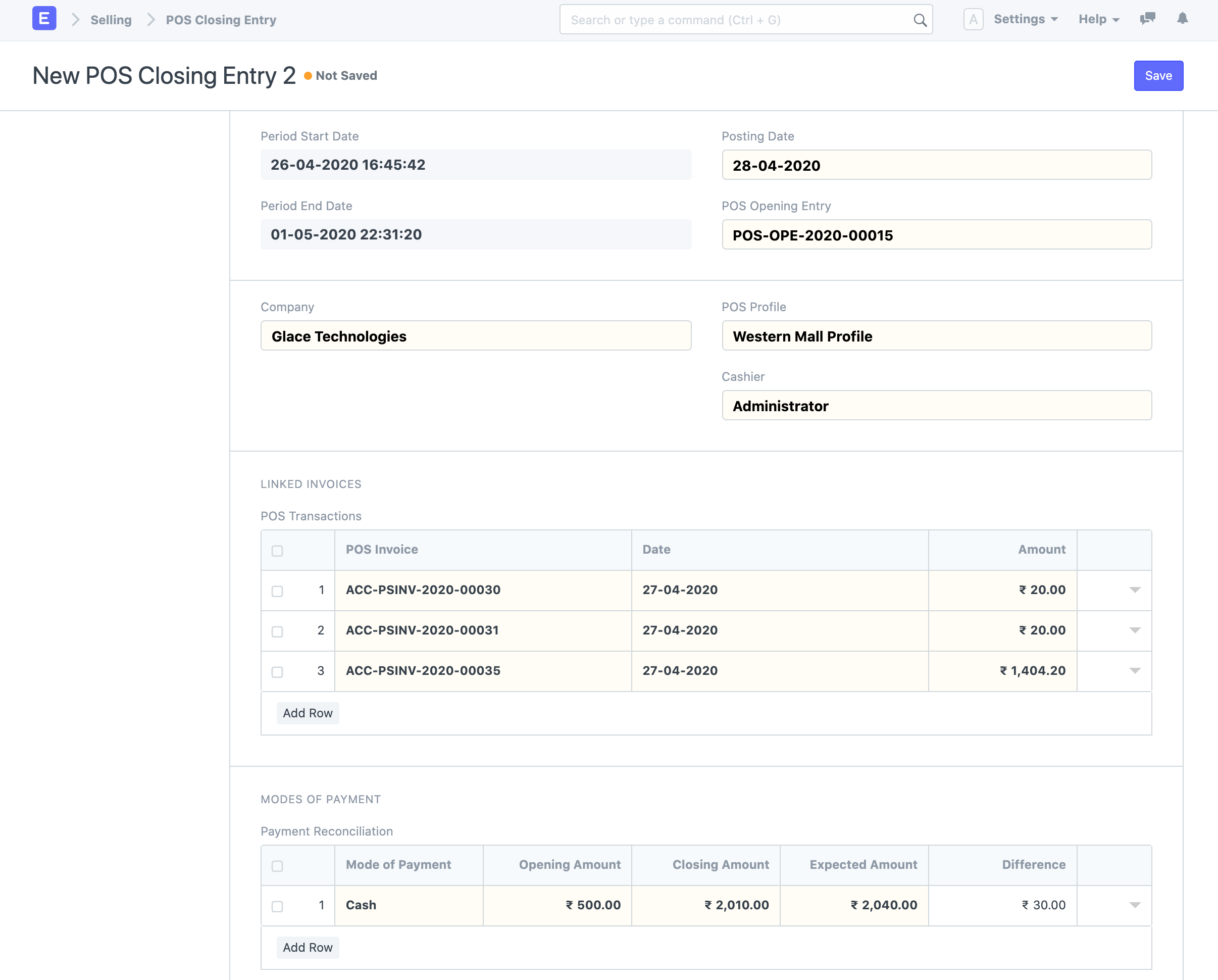
Opening Entry
- Stores POS Profile and cashier (user)
- Stores the opening balances of different mode of payments used in POS.
–
-
Closing Entry
- Linked with opening entry to fetch pos invoices transacted between opening and closing period.
- Each cashier will have to create opening and closing entries with opening & closing balance.
- Submitting the closing entry will create multiple sales invoices based on customer.
- Returns will be merged into a credit note.
–
-
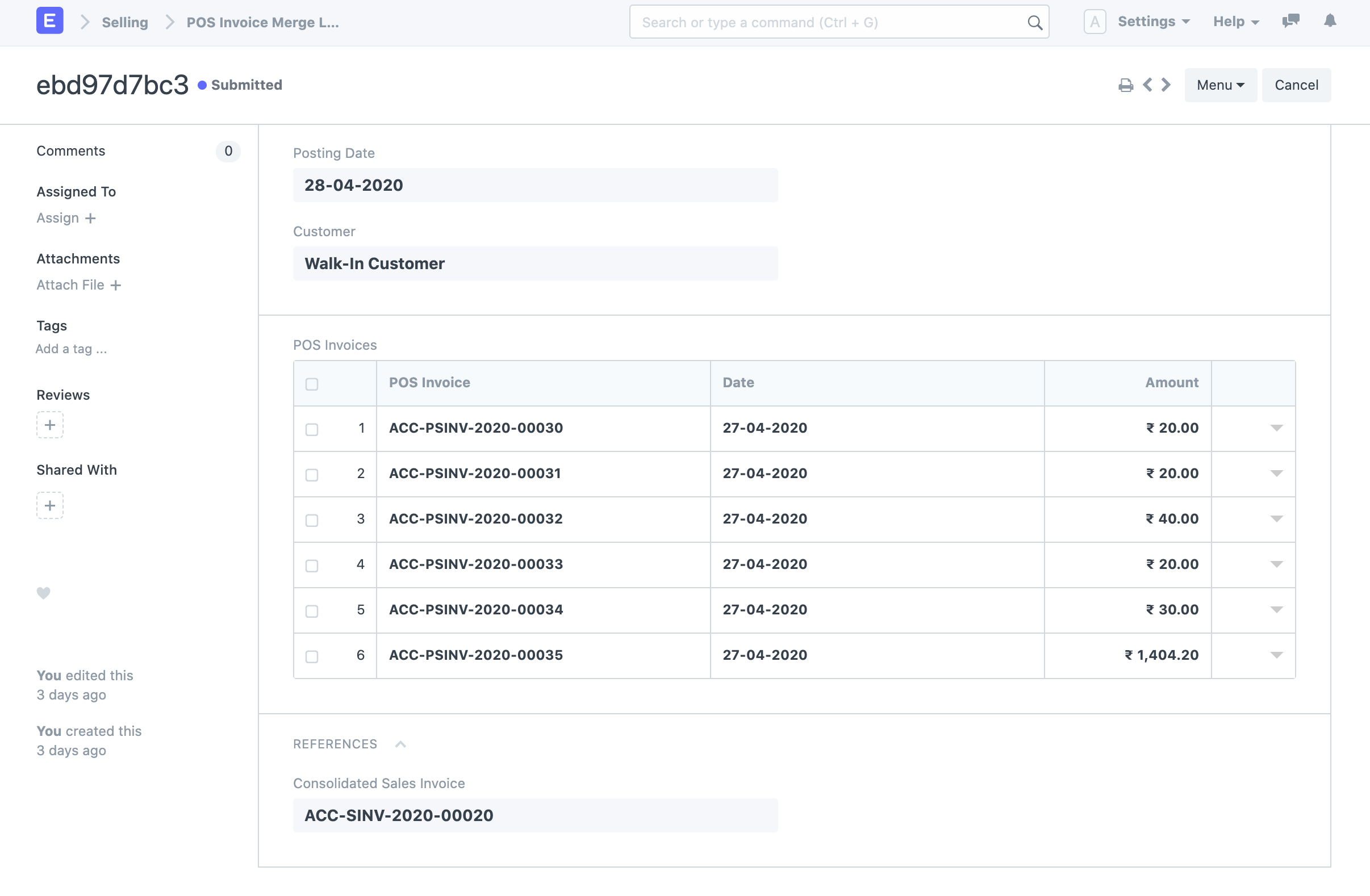
POS Invoice Merge Log
- Auto created on pos closing.
- Used for logging pos invoices and corresponding consolidated sales invoice
–
-
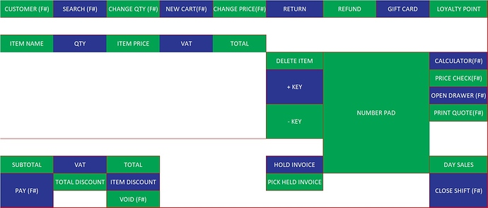
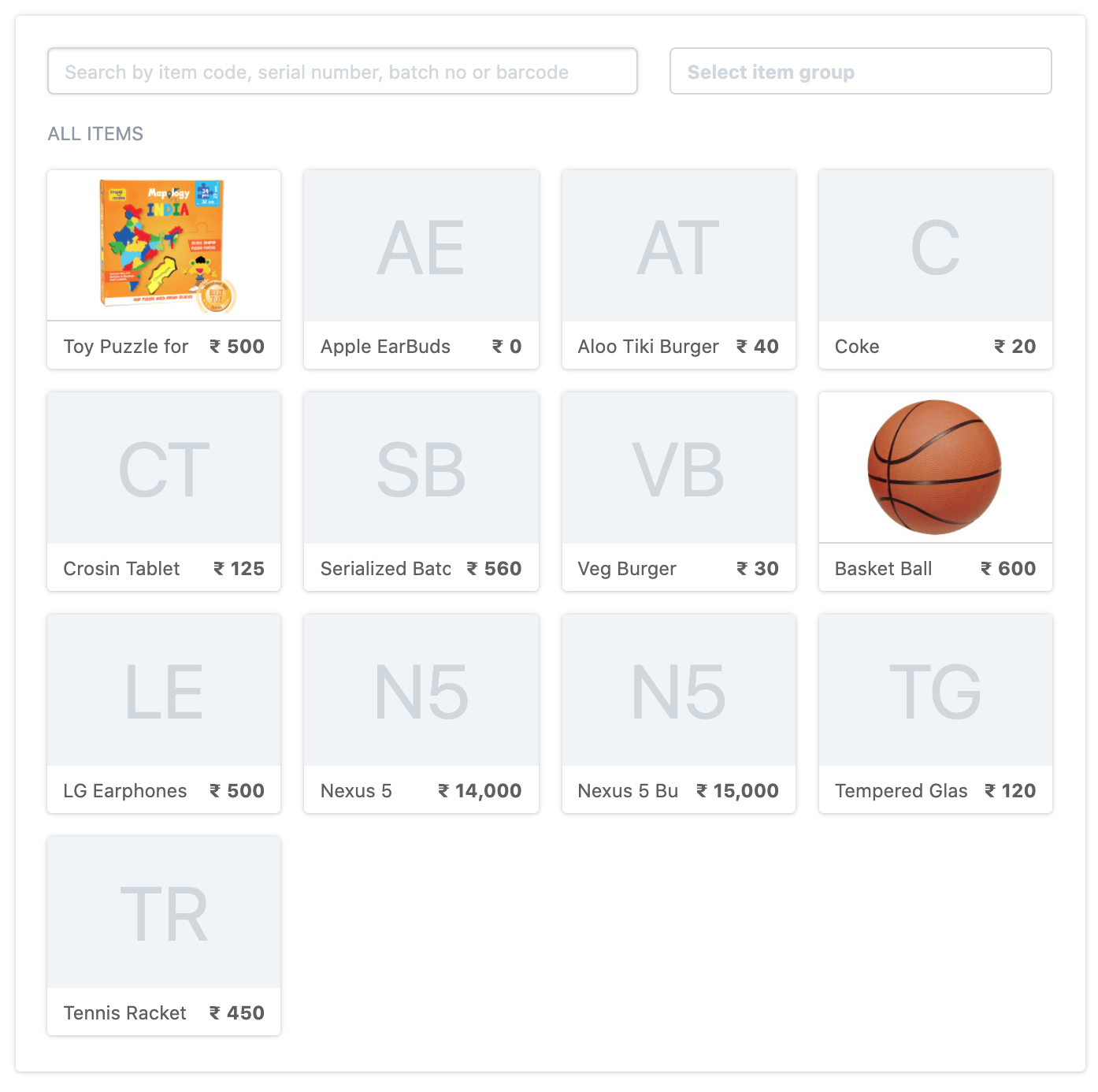
New UI
- Item selector
–
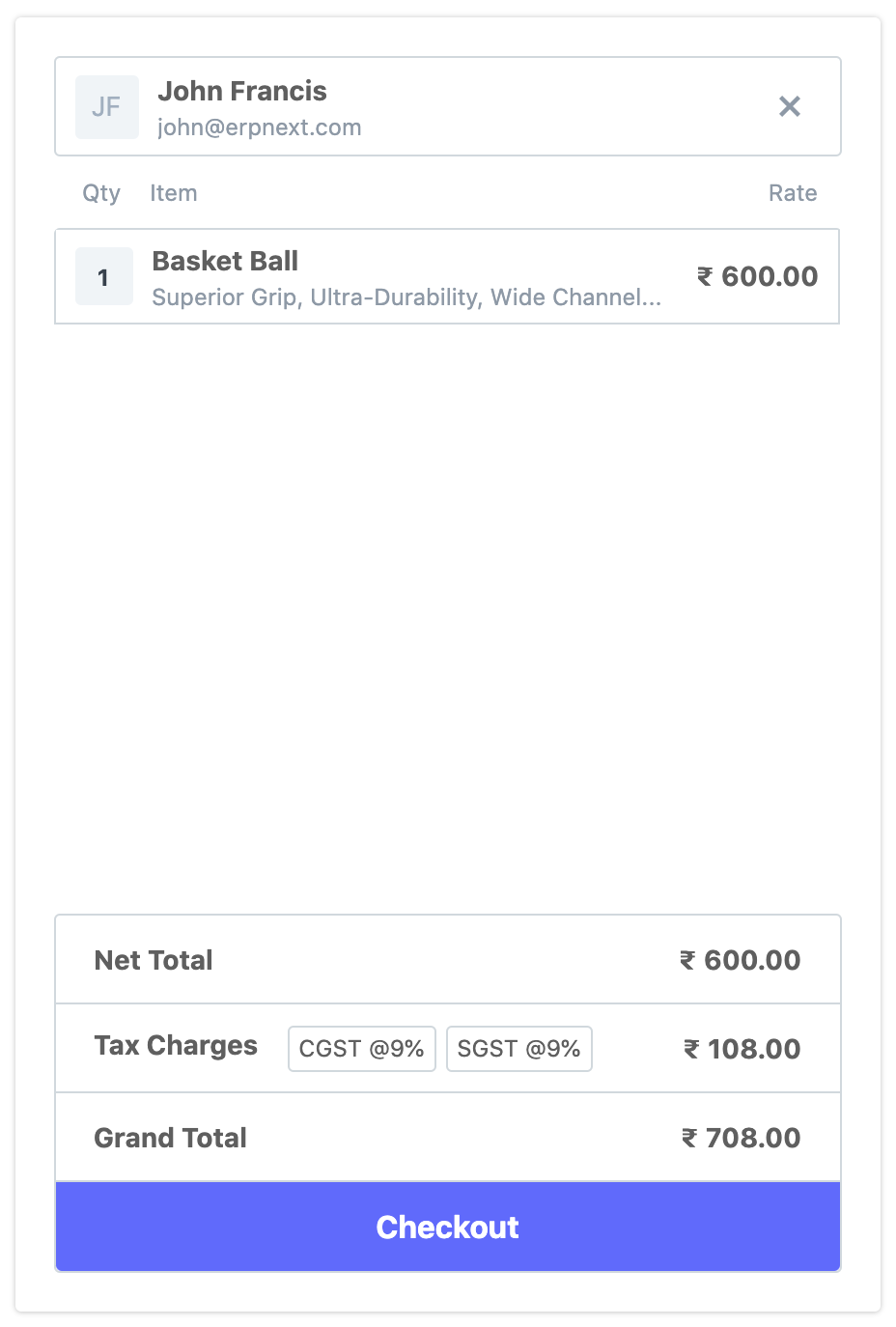
- Cart
–
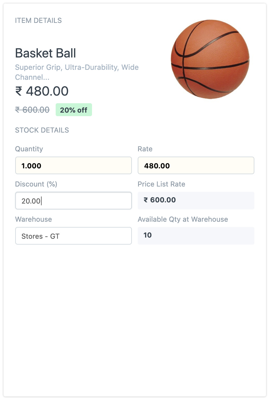
- Item Details
–
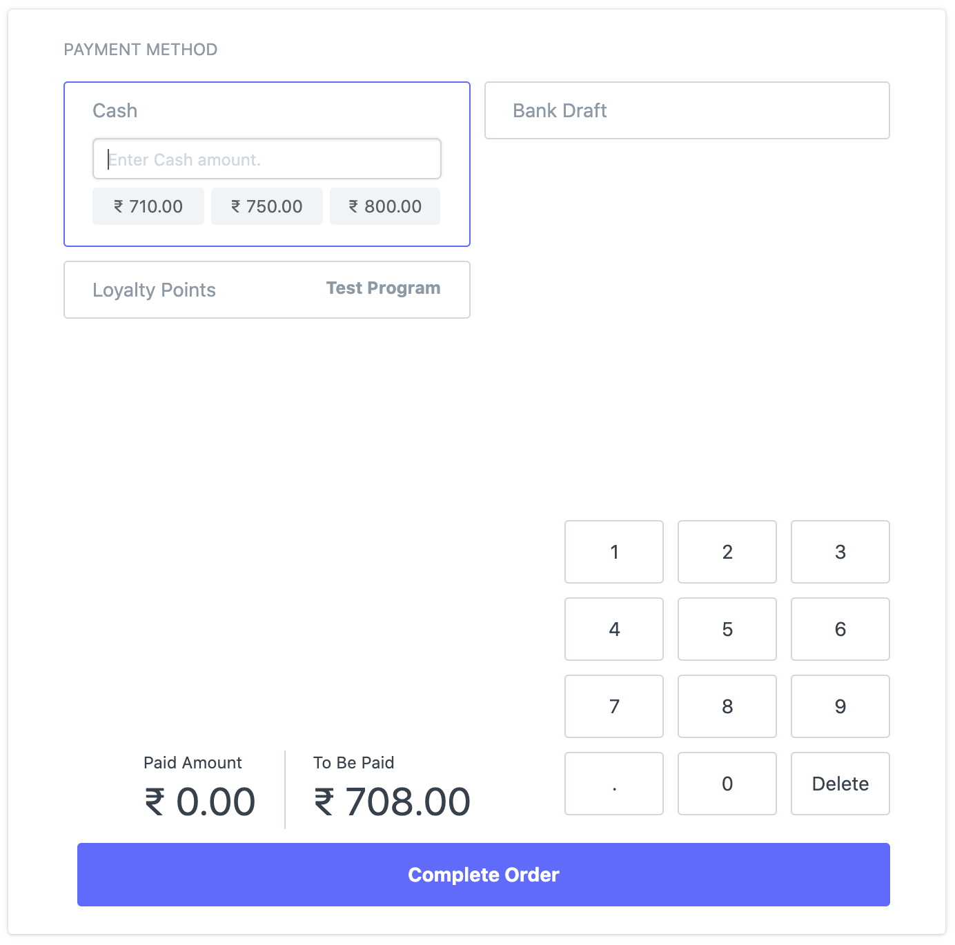
- Payment
–
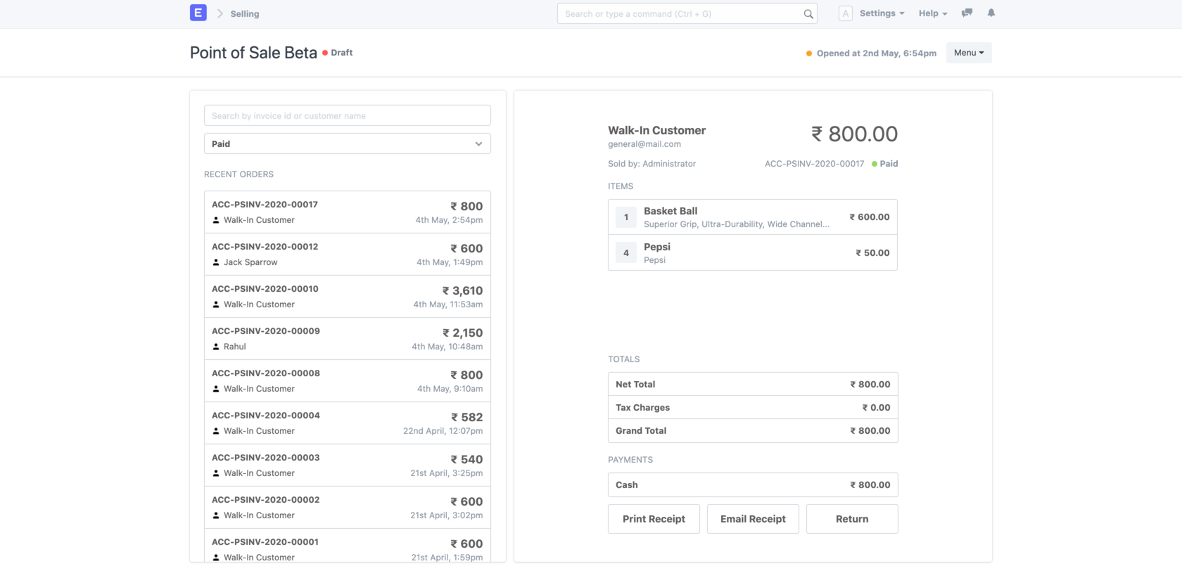
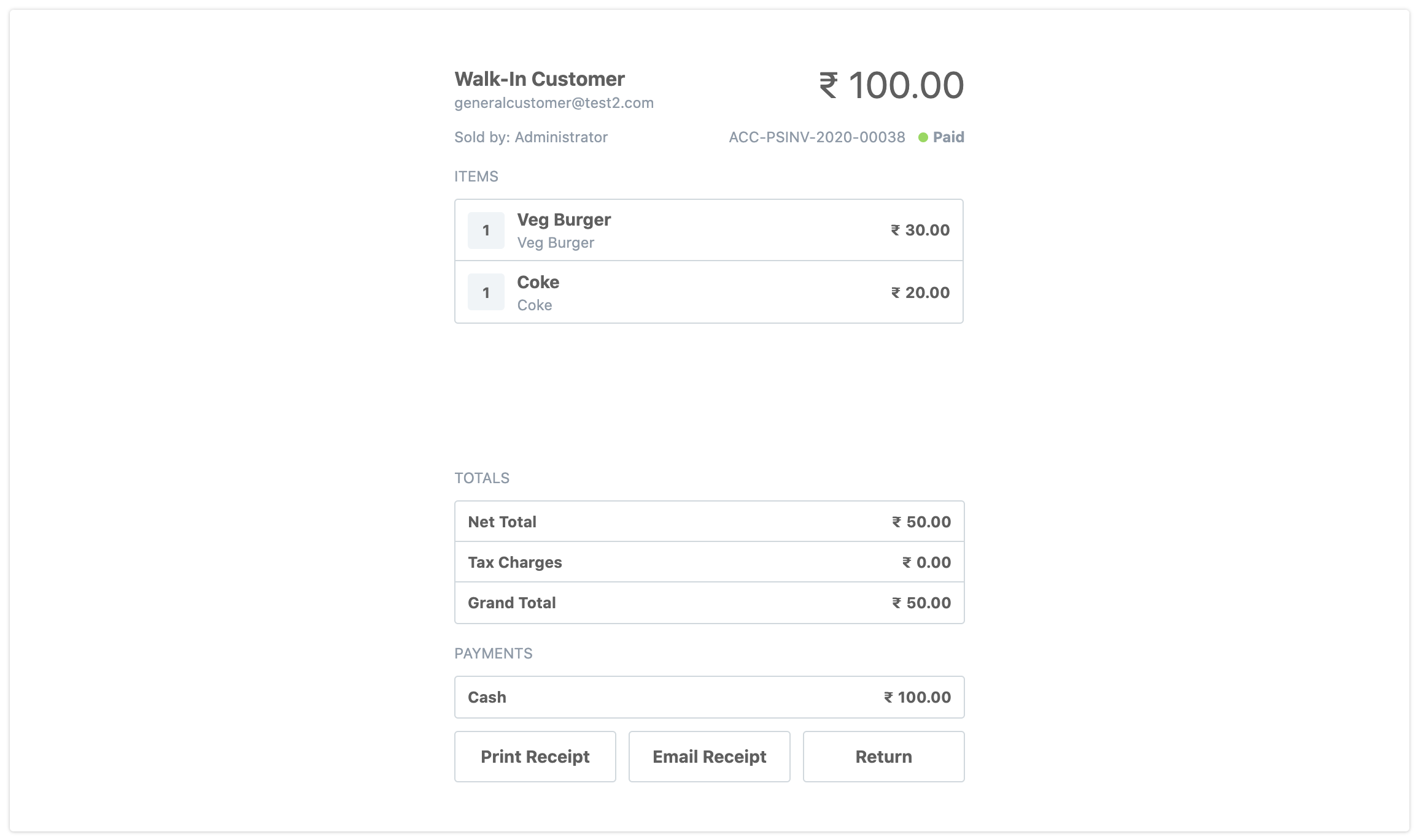
- Post Payment Screen
–
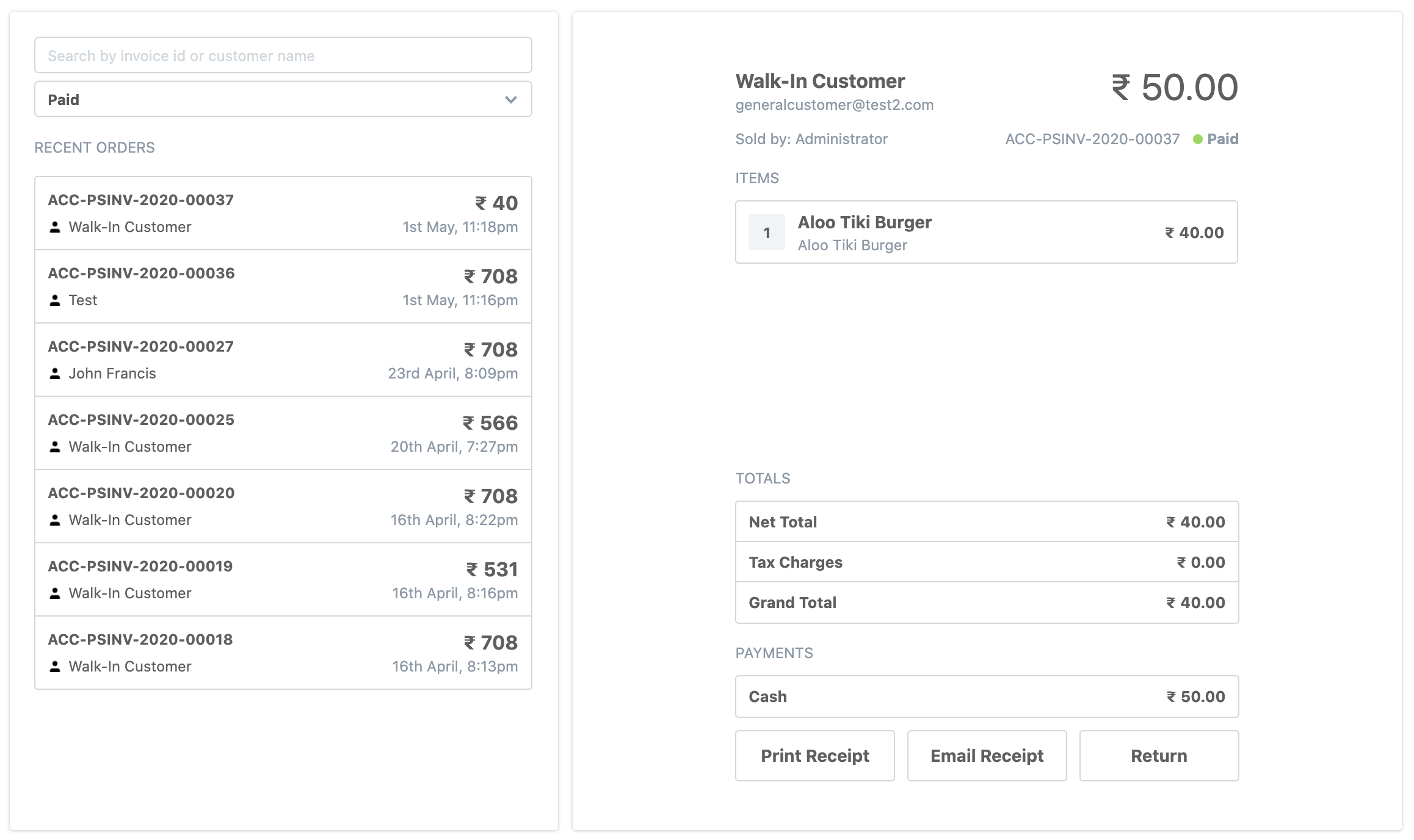
- Recent Orders
–
- Item selector
If you have a local test instance, then pull the changes from this fork. After pulling the changes run:
bench --site [your-site-name] migrate
bench build && bench restart
I’ll shortly set up a public test site on which non-devs can test and give feedback on.