Hey Frappe Monsters,
I’m creating a Report in frappe.
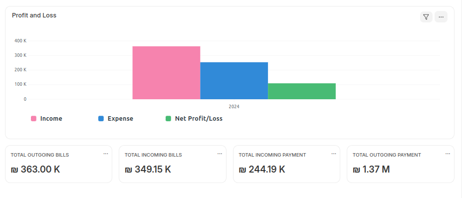
and I wanted to make a chart with summary boxes just like the one in accounts (the one in the picture, it’s created by frappe), Now how can I convert mine to the frappe accounts chart and how can I customize my chart more.
this is the code that I used in my report python file
chart = {
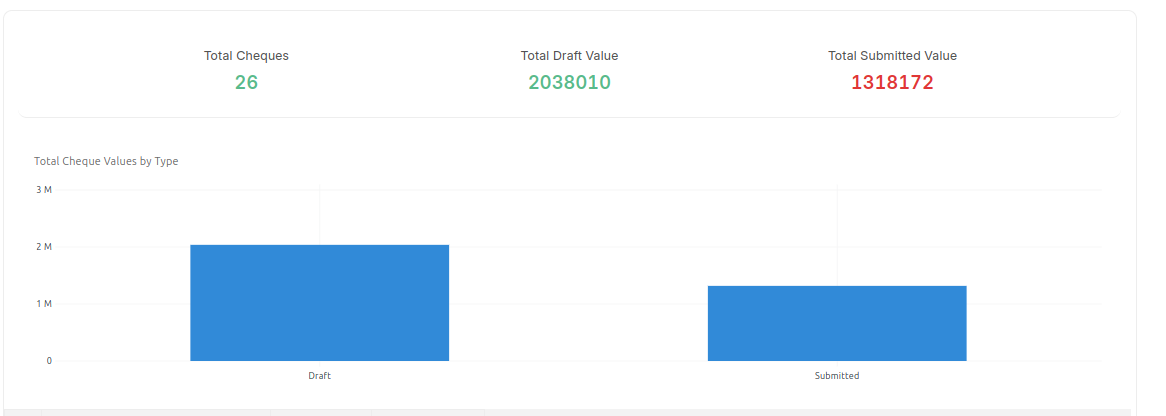
'title': "Total Cheque Values by Type",
'data': {
'labels': [
'Draft',
'Submitted'
],
'datasets': [{
'values': [
cheque_summary["Draft"],
cheque_summary["Submitted"],
]
}]
},
'type': 'bar',
'height': 100,
'colors': ['blue', 'green'],
}
and this is my result
and this is frappe chart in accounts
And Thanks in advance