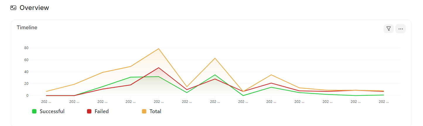
HI everyone, i want to customize Chart in workspace, gradient line or beautiful chart. Do you know how?
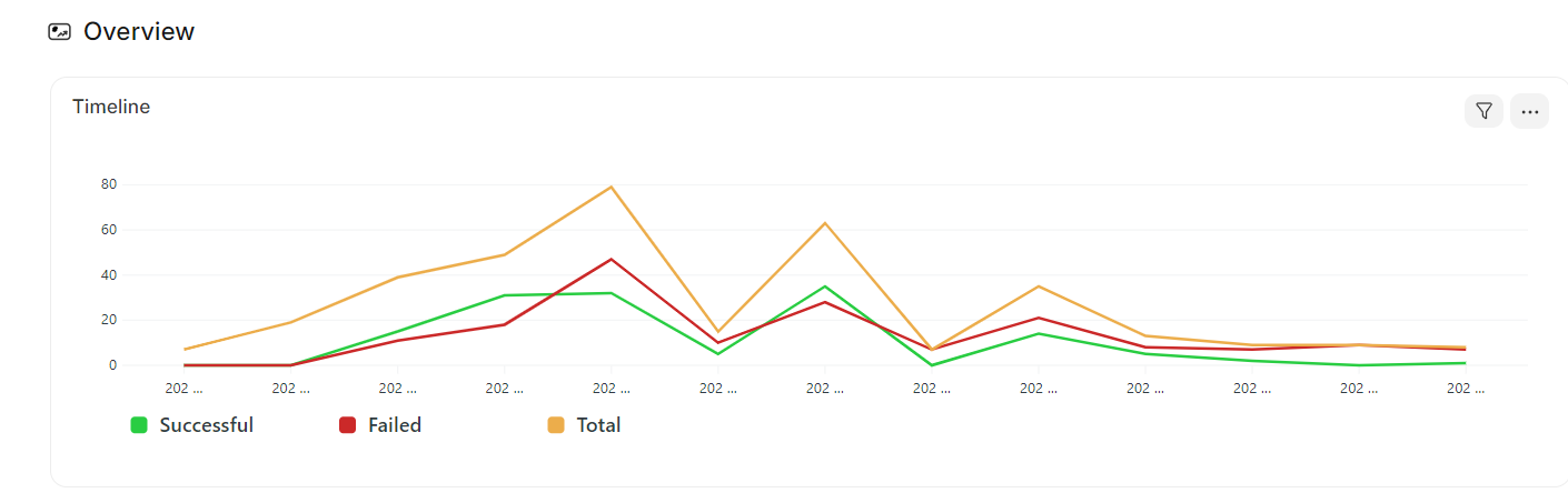
Expect;

I just have timeline_history_chart.json in source. And i use Report Chart
HI everyone, i want to customize Chart in workspace, gradient line or beautiful chart. Do you know how?
Thank you so much. I got it. How do I look up other custom options. I don’t find it on the frappe framework’s doc.
ask Mr. GPT ![]()
![]()
![]()
He just helps me sometimes