i got a chart demo,Now I want to implement this feature,as follows:
import that: The Y-axis has two scales
1 Like
See here: Mixed Bar/Line Chart how the data is to be presented in the chart object.
thank you,I’ll go to have a look
It seems to be unable to meet my needs,There are no coconfigurable parameters to implement the two Y-axes
It says:
All the
lineOptionsandbarOptionsapply to mix and match datasets as well.
So I thought maybe the height option, which is mentioned here
can be put into the two datasets with different values (but didn’t try it myself).
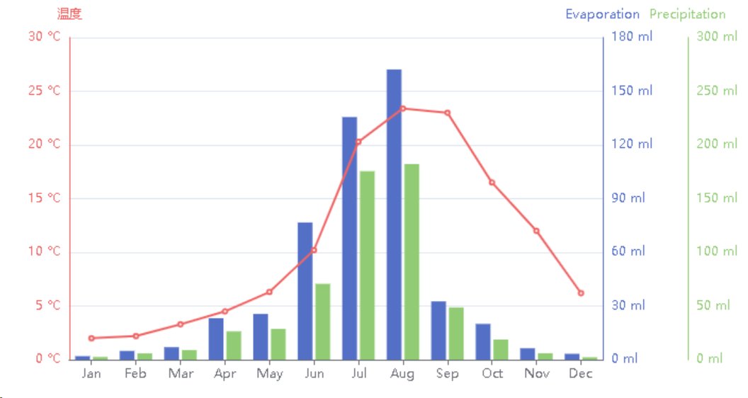
BTW (regarding the sense of the content), I find it deceptive to put two different scales for evaporation and precipitation, because one might think, at first glance at least, that more water evaporates than is arriving from above – but which could be true near a river or a source or so, so it’s just more difficult to read this graph, as the green and the blue scales somewhat occult the difference and even reverse it. So it creates an impression of drought, while in fact there is water to grow plants or to resupply drinking water layers underground.
Anyway, that’s not a reason to not implement this feature (IF NOT EXISTS), because it can be totally useful and legit in many cases. So I consider it definitely a good feature to have.
Many scenarios may be used such as industrial current and voltage recording