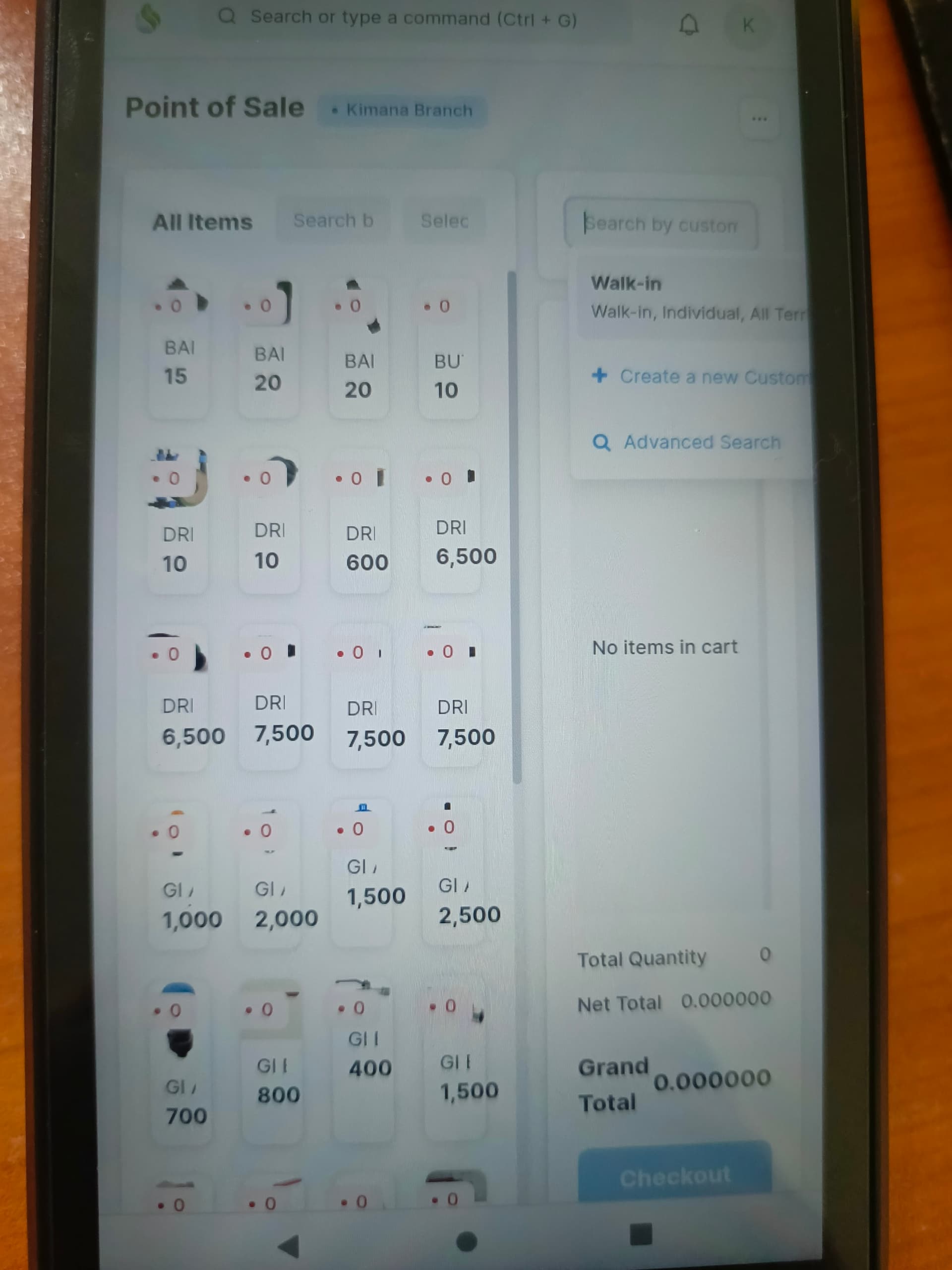
I have deployed POS Awesome on mobile devices across more than 10 regional shop locations. Currently, the default grid layout, displaying four item columns, severely restricts usability on smaller screens. Users are experiencing difficulty selecting items, viewing item prices, and checking stock levels clearly due to layout congestion.
To resolve this, I would like to customize the POS Awesome layout for improved responsiveness and usability on mobile devices:
- Adjust the item selection grid from the current 4-column layout to a responsive layout of 1 or 2 columns, enhancing visibility and ease of selection.
- Reposition the search and cart sections to dock underneath the item selection area, ensuring clearer navigation and more intuitive user interactions on smaller screens.
Could you provide guidance or practical pointers on effectively achieving this responsive customization within the POS Awesome application?