Hello everyone!
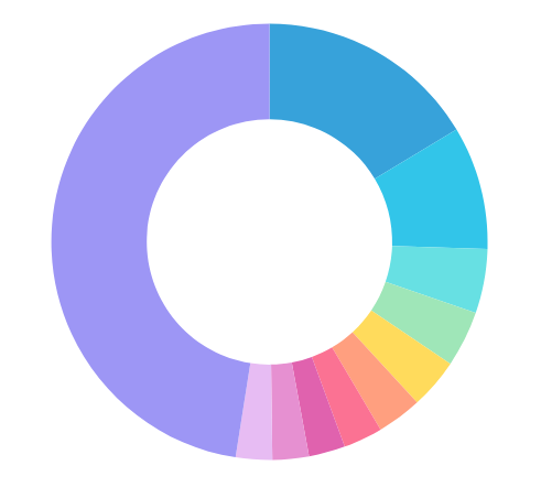
I’ve recently updated to the V3 version of Insights, and I’m still trying to get the hang of things. Once thing I noticed was that, when I’m building a “chart”, whatever I use as the label for Pie charts or as a Split Series for Line charts, it always limits it to 10, when before it had an option to set how many values we wanted to list.
What happened to this setting, and how can I work around it, since currently most of my charts look like this
Thank you!