We are building the website on Frappe Builder , however the designer with whom I am working he is complaining about the complexity to make the website mobile reponsive example , many components of the web version does not automatically fit into the mobile version , a lot of tweeks is required , to an extent that it feels very daunting.
ANy thoughts ? , any other person facing the same issue.
Regards
1 Like
@Nsuregrowth There are a few best practices you need to follow when creating pages in Frappe Builder to make sure they look good on all screen sizes, especially mobile, without needing too much manual tweaking:
- Use relative widths for containers
Instead of setting fixed pixel widths, use percentages (like 100%) and combine them with a max-width. This helps the layout adjust based on screen size while maintaining a clean structure.
- Avoid using “free” (absolute) positioning or large margins
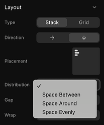
Absolute positioning and large margin values can cause layout issues on smaller screens. Instead, use tools like alignment, spacing, distribution, and gap controls to position elements within containers.
- Switch container direction to vertical for mobile
Horizontal layouts that work on desktop often get cramped on mobile. Changing the direction of your container blocks to vertical helps maintain readability and spacing.
You can also check out this following stream where I built a responsive webpage from scratch: https://www.youtube.com/watch?v=Iw9471qc41k
Let me know if you need more help on this.
3 Likes
