Hello,
Hope you are all doing well! I wanted to share some feedback with you regarding the recent update to the Frappe Docs UI. I am starting this discussion in the forum to see if anyone else has similar thoughts and to suggest possible solutions.
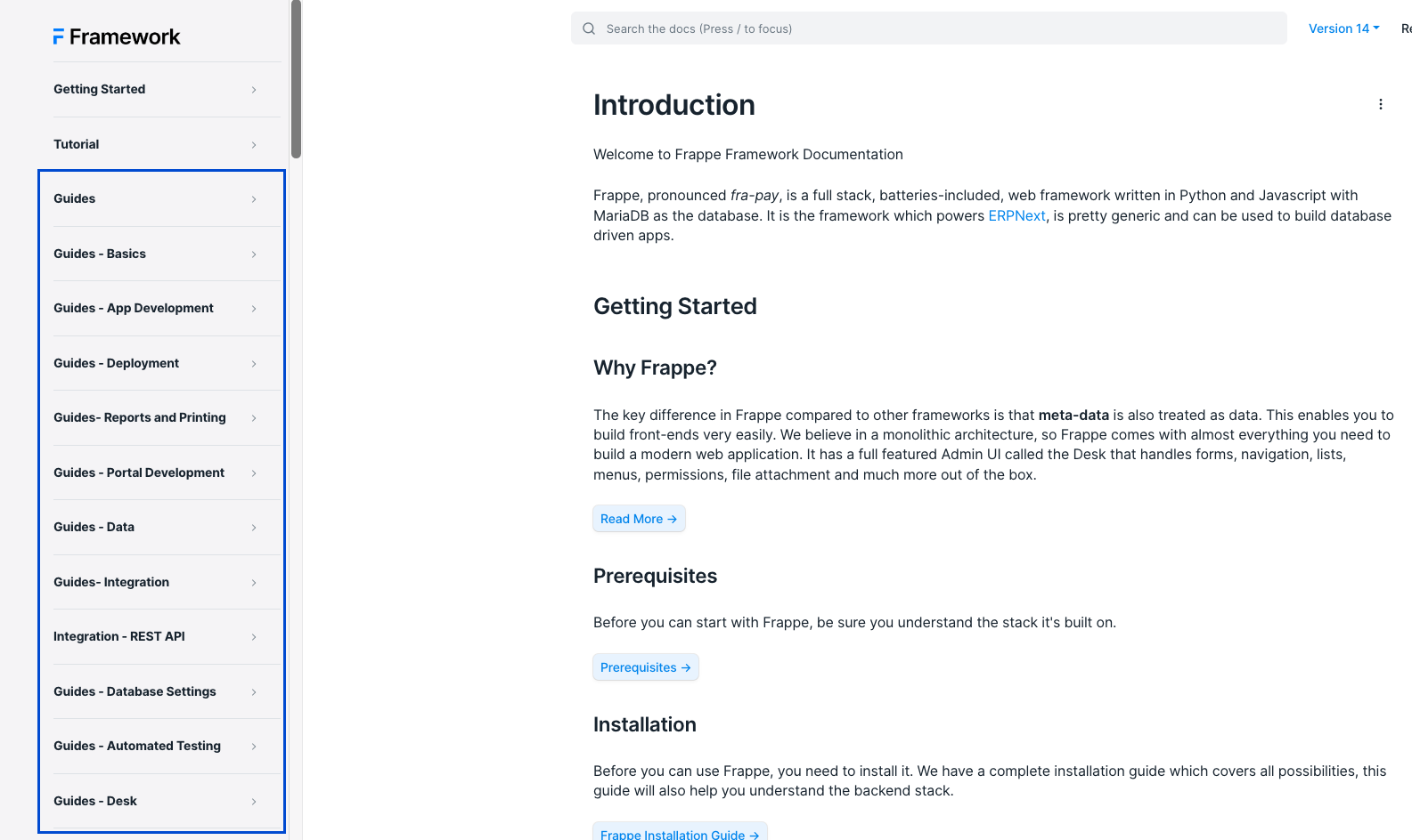
While the new UI design is visually pleasing, I have noticed some issues with the user experience that I believe need to be addressed. Firstly, the main navigation appears to be disorganized and cluttered. In the previous version, there were clear main menu items and sub-items. However, in the current version, everything appears to be a main menu item. For example, in the attached picture, all the guides items should be sub-items under the guides main item. The lack of clear hierarchy makes navigating the documentation difficult and unpleasant.
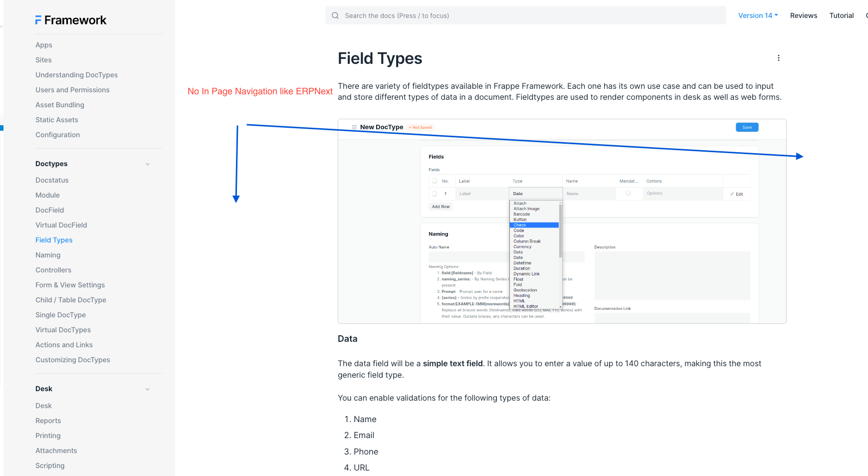
Secondly, the “on this page” navigation menu that used to be located on the right side of the page is no longer available. This makes it difficult to locate specific information within a document. For instance, in the attached picture, if I wanted to go directly to a specific field within the docfields document, I would have to scroll up and down the page. If I am unsure of which field I am looking for, this process becomes even more time-consuming and frustrating. The previous “on this page” menu was incredibly helpful in this regard.
I believe that addressing these two issues would greatly improve the user experience of the Frappe Docs. I would love to hear your thoughts on these concerns and any ideas you may have for resolving them.
An excellent illustration of both points can be found in the erpnext documentation website, which provides a live working example.
Thanks in Advance