had the same problem on chrome on a macbook, try to wait for some time till it loads the first time.
I agree with @jay awesome bar is an awesome tool to move around
Yes, I was waiting for about 10 minutes, but there was no progress. On the contrary, at iOS 9.3 there is no issue and everything works fine. I was accessing ERPNext via Safari in both cases.
@strixaluco can you specify the version of frappe & erpnext? or are you on develop branch?
We are on your subscription plan.
Installed Apps ERPNext: v6.27.3
Frappe Framework: v6.27.5
Frappe Subscription: v0.0.1
Mandrill Integration: v0.0.1
Please avoid any form of collapsible UI-elements. IMO, these are very bad for a snappy workflow as you’ll have to point-and-click to see things. Scrolling with a touch-pad, or page-up&down or hitting space-bar is superior to any form of hidden UI-elements…
1 Like
Please also consider my two previous posts. I see very little use of exposing the full system modules in the left side-bar.
Say you are working with warehouse, you rather use that space for sub-module navigation.
The old UI provided better focus as both menu-options and the more descriptive horisontal “link-bars” gives a more solid look. Also solves and can be reused to sort out the mobile / small-screen issue.
We already have short-cuts to quickly get back to the main-screen or to the search bar. Again, having the main-menu links on the left-pane is redundant when all you want to do is focus on the particular module, say Projects. I suggest to instead see how the left-pane / submenu could be utilized even further, but based off the old look & feel.
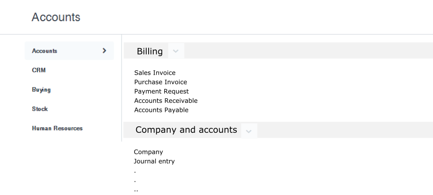
For anyone who is worried about confusing the end user with all modules on single page - Please consider the fact that most users will have access to only few modules. For e.g. a stores user may have access to stock and HR only. For such users, not all the modules are listed. In our case, the screen for our stock user looks as below -
It is not cluttered, and I have to say that this new UI emphasizes the logged-in user’s functionality very clearly. This is clever design. You can see that Stock Entry is the first item for the stores user, which is exactly what he will be doing most of the times. And the important reports that he will have to access everyday are also on top.
It may be confusing for us (read implementors, developers, product owners, adminitrators etc) who have access to all the modules, in the beginning. Even then, it is a matter of time and getting used to it.
2 Likes
Truly a balance. I couldn’t see the screen-shot above though.
I’m a strong believer of keeping point-n-click style mouse interaction at a minimum when it comes to hiding/showing information.
We should try and find a way to make any user interaction & form entry contextual to reduce friction and keep the need for training/manuals at a minimum.