Hi I just installed an ERPnext instance using easy_install script and I find major UI changes inside this release. However I liked the previous UI. Is there any way to rollback this UI changes for my particular instance ?
http://imgur.com/Gs8e7yu
1 Like
@srajelli, yes, do you can revert it in git, but I dont recomend it, because when do you upgrade it will replace to the new desk again!
in frappe-repository git revert v6.27.1
To get it working forever, never upgrade your repository!
1 Like
Any special reason?
@rmehta I feel if you have too many things on your screen you get an information blast and things starts looking complicated even if they are not. Though my observations is based on just the screen shot shared above.
I must agree. I can get the new 2-column layout and the fact that things are now grouped which is nice. But UI-wise I think the previous one was way more appealing. The new has a bit to raw look, html-style.
I think what would help is to ensure to stick to a grid and certain spacings. The options in the 2-col has about 4 lines per 3 lines in the left-pane side-menu.
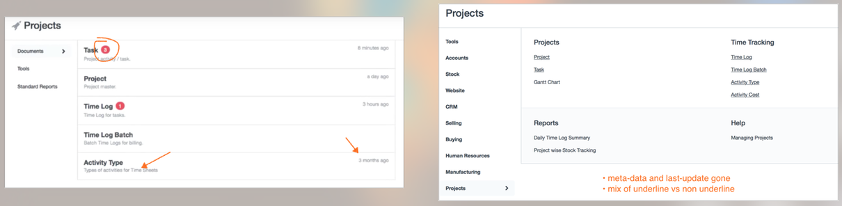
Getting a short desciptive text what’s hiding behind the link and a last-mod date give some idea on where things are.
But mainly, the fact that the “main menu” stays on the left is causing visual confusion (at least to me). Back/forward short-cuts and buttons in a browser is fast and people are used to it. I definitely liked more when the left pane zooms in and focus on the top-level category options that module/section is offering, rather than now when it’s all stacked in one long scroll.
2 Likes
Also, the side-bar is basically a mirror of the main desktop-screen which I think does a better visual job of drilling into a certain module. the ctrl-g shortcut can solve the issue if the main-options are not shown once one level down.
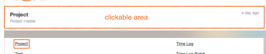
I also think that the full area of one “UI-row” should be clickable, not only the actual text-link. This became a tougher in the new design as the text is quite small, especially for short options like “Task” which requires some focus to hit when using a track-pad ![]()
old vs new below
(not sure if the whole rectangle was linked, but would definitely be preferred to make navigation a breeze! same goes for the collapsible rows in a document where about only 50% of the row height is clickable.)
2 Likes
To add to the convo, I also am in favor of the old look, though I know change is annoying at first, this one is a bit confusing and as others mentioned an information overload. Another thing is before It was pretty straight forward what each user had access to…now I fear the users will see more things in the ERP and want access which they shouldn’t be able to see.
Maybe the nav demo here: https://getbootstrap.com/docs/5.3/components/accordion/ where it looks like a hyperlink, but on hover shows a tab.
why you guys didnt make it for us to chose from which UI to use? grouped or singled ! i think its much better that way because i was so confused today after update…
Lots of things in one window will confuse user, however it will give access to whole things from single point.
I like new UI since navigation will be reduces, I can easily navigate between modules and report without going back to desktop.(Same is available if we can use search box)
To balance Previous and New UI, we can Increase font size of first section document/report and keep other section collapsible. Also link should be whole box click-able.
(I am not UI expert, but it will defiantly increase user usability and navigation)
5 Likes
The pages with new UI look overloaded indeed and I agree with @kolate_sambhaji that the font size is too small. Probably 2 or 3 optional font sizes would increase usability.
@rmehta The grouping of features in the new UI is perfect but I prefer the 2 column layout. The 4 column layout is very intimidating .
Keep the New Grouping of the features but in 2 column layout . Much easy on eyes and look very friendly.
Looks good.
- Is this page configurable like, some of the element i don’t want to show in first page itself. possible?
- It would be great if we keep all reports together with title specified. Example currently : Accounting statements in top of second column and Other Reports, Customer Reports bottom. If we keep all these reports title one after another would be good to search the reports.
regards
Jahir
The new UI looks cluttered and it is very difficult to find items that you are looking for. Is there a way to change back to the old UI setting.The old UI looked much more clean and user friendly.
-Amit
3 Likes
Hi @rmehta
on Desktop we can hide the unwanted module but in this new UI I can see all modules as well as custom apps on left hand side when we click on any module on Desktop.Is there any way that we can hide it from that list also ?
wow, didn’t realise it has changed because i tend to use awesome bar a lot, yeah it does feel more “complicated”. On the bright side, all available functions are presented on a single page which is positive for new user. ![]()
1 Like
Thank you for fixes, @rmehta, now the text looks better, but IMO still a bit tight on the smaller screens (e.g. the phone)
Hello All,
The new UI reduce the navigation and user can access any module from single page , but he/she may get confused or pressurized due to many options on single page.
The old UI require few more clicks but it was better , clean and gives pleasant feel to eyes.
This is my personal opinion.
1 Like
The new UI does not work on iOS phone. After login, the desktop does not display. Anyone experienced the same issue and/or has the solution for this issue?

Confirming similar issue on iOS 9.0.1. After login there is a screen with an ERPNext logo, but nothing follows.