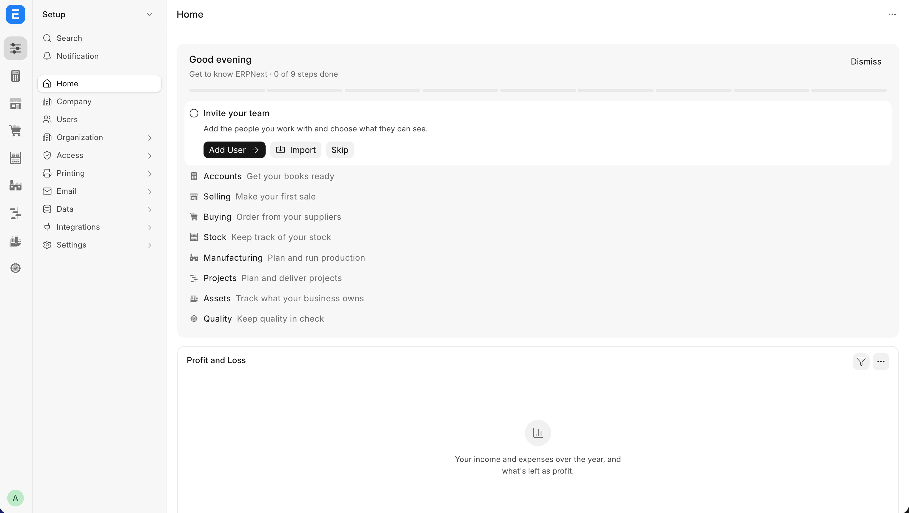
Hi all
I have been actively tracking the developments in terms of the navigation UX ever since v16 came out. At the time of this writing, the navigation system has become unimaginably complicated and impossible to navigate.
Even for someone like me who has worked on the Frappe framework and ERPNext app for over 15 years now, the system is just impossible to navigate in a any logical way. I cannot even imagine how difficult and deal breaker it will be for new users and companies who are looking to adopt ERPNext.
I fully understand the time and effort that goes into maintaining such a huge system and release new features so I generally prefer not to use harsh feedback and try to be as constructive as possible but this I am going to be a bit open with my criticism.
Before I begin, here’s some context of my previous feedback:
Peak UI/UX of v13
Honestly, I feel like the v13 release in 2021 was the peak of UI/UX in Frappe products. I genuinely feel that was a major leap and I think the most important reason for that was because it was crafted by a professional design agency called Timeless.
They created a whole new design system for Frappe and they followed all the standard priciples of UI/UX design. They created a design system that was unique and stood out on its own.
It was a great release.
Just for context here are the release notes:
And here are the mockup screens and components from the Timeless:
v14 and beyond
For some reason it just started going downhill from v14 release (in terms of UI/UX). The framework is still as solid as before and ERPNext and other apps have tons of new features now. However, the UI/UX side of things just went the other way.
For some reason colors were dropped from the whole system. The classic blue colored action buttons and dots were gone. Everything just became plain bland black and white. The best guess I can make is the need to replicate what Shadcn was doing in the JS world, with all the black and white components. I understand the need to follow latest trends in the tech world but unfortunately, ERPNext is a huge, information dense system and colors and visual hierarchy is the foundation of such a system.
ERPNext is not a system made for “developer experience” but it’s made for business users who care about getting things done in a usable and feasible way. I don’t know who was taking the decisions at Frappe about these UI/UX decisions but those were definitely not helping on the ground, in the real world. I personally have received tons of client feedback from real world projects who have literally abandoned the system just because of the poor UI/UX despite it being such a powerful system.
v16 announcement and the return of the desk
This was just a total shocker to me. I have written about it in detail here:
The return of the desk just made things go downhill at an exponential rate.
v16 - “Double Sidebar Season” at Frappeverse 2026
That’s what @sohamkulkarni said when he announced the double sidebar system (dock + sidebar) at Frappeverse 2026. That was the “solution” to the navigation system.
Again, without wanting to demean or undermine anyone’s hard work and effort put into it, it was a totally unimaginable solution. It felt like a “developer” solution to a “design” problem. It didn’t feel like someone with proper knowledge of UI/UX principles had created / approved this “solution”.
Now let’s talk about the issues
1. Non-persistent Dock?
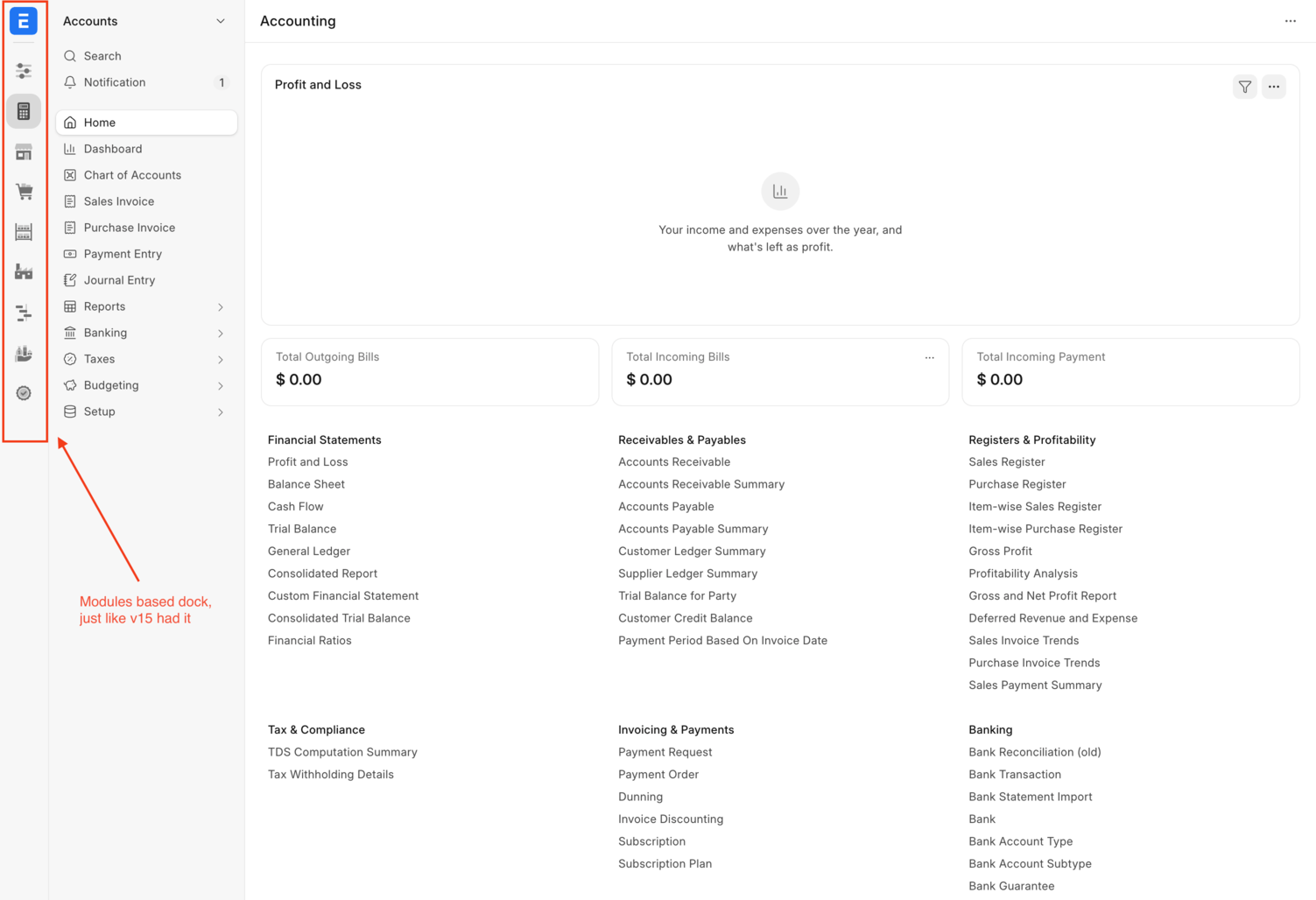
The whole idea behind the Dock is to have a persistent menu (icons) across the whole system. That’s how users are supposed to “go back” to different modules. But now it seems like the Dock itself is not persistent and it simply changes based on where you’re in the system.
In most apps, the dock shows the standard modules based icons (just like v15 had it) like this 
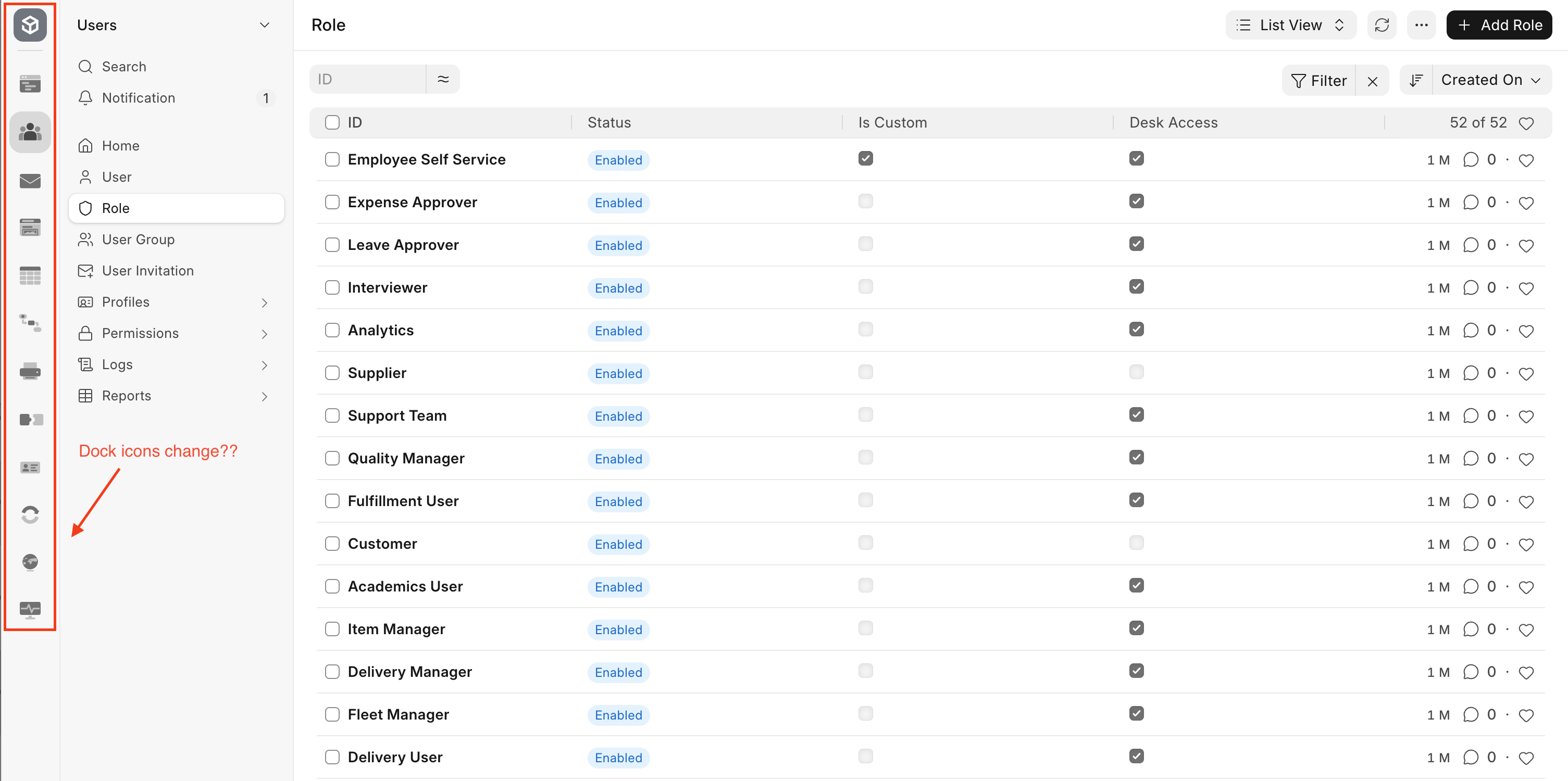
Then when you switch to the Build screen (The Frappe app), the dock suddenly changes and shows completely new icons. Now the user is totally confused about how to go back to the “Selling” module for eg because it’s no longer in the dock as was expected
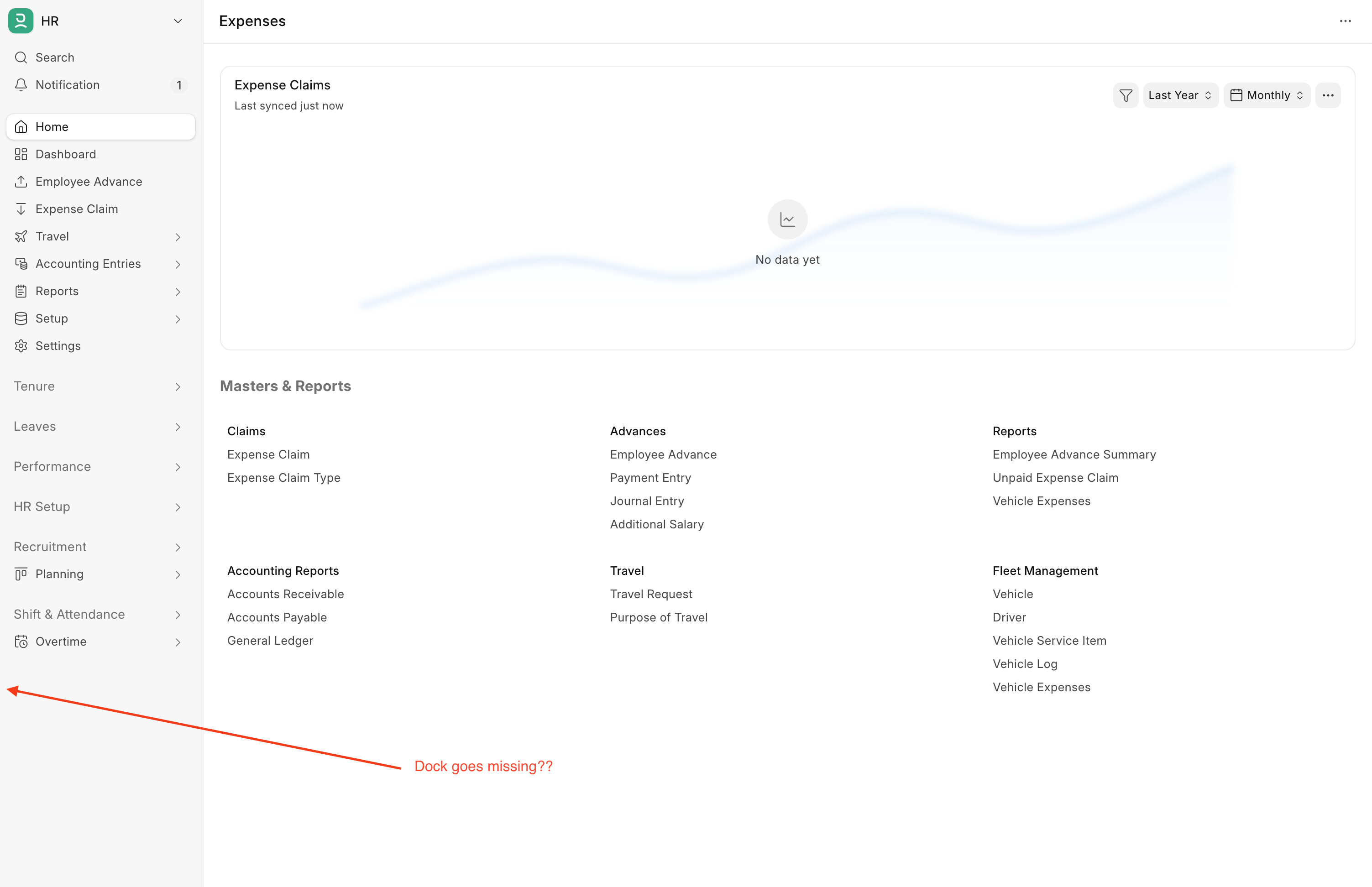
Then when you change the app and go to HR app for eg, the Dock completely disappears! What?!? Where did it go? The user again wonders where did the Dock go? Did I do something wrong? How do I go back to the Selling module quickly?
Settings, Settings and more Settings
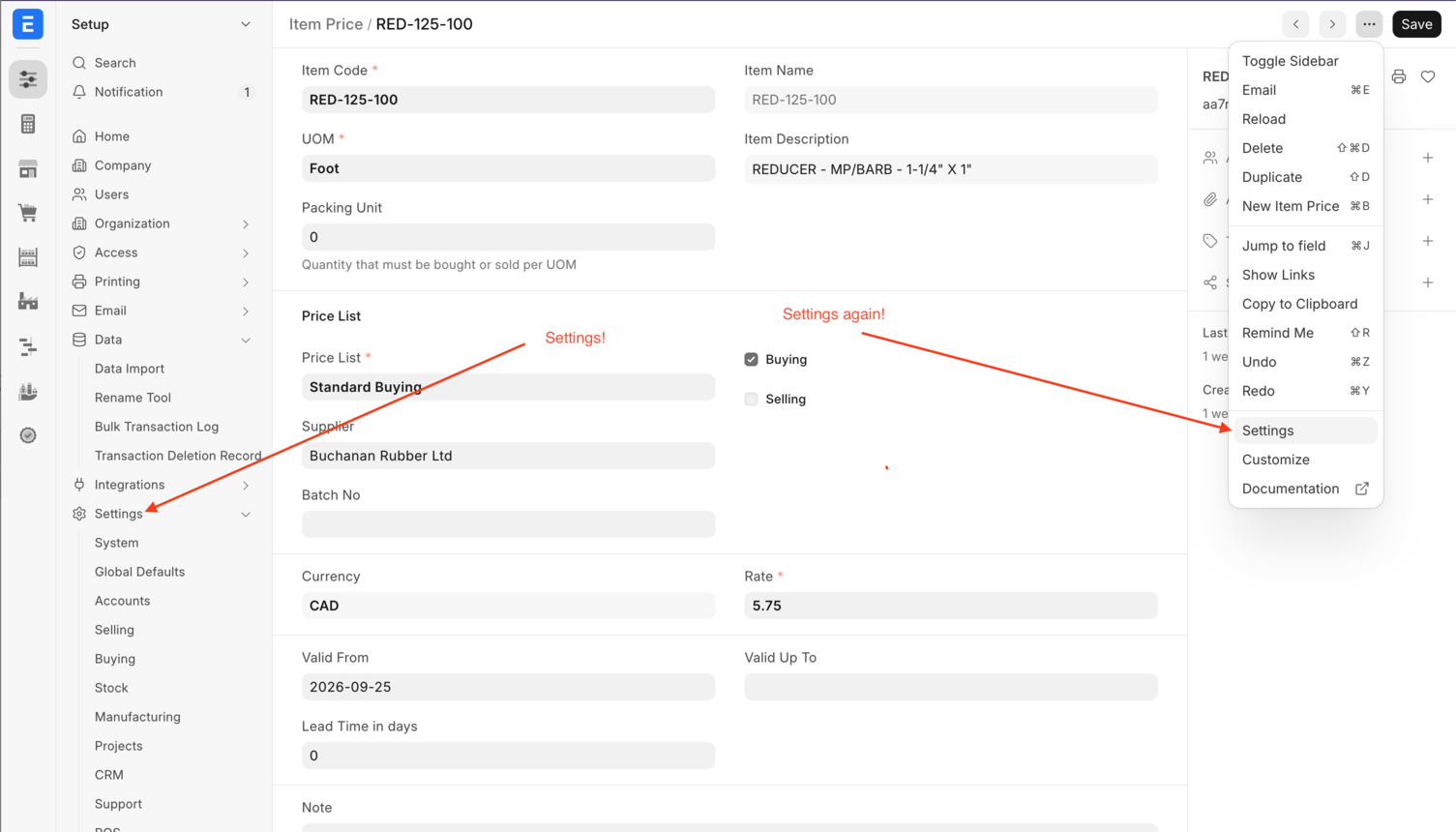
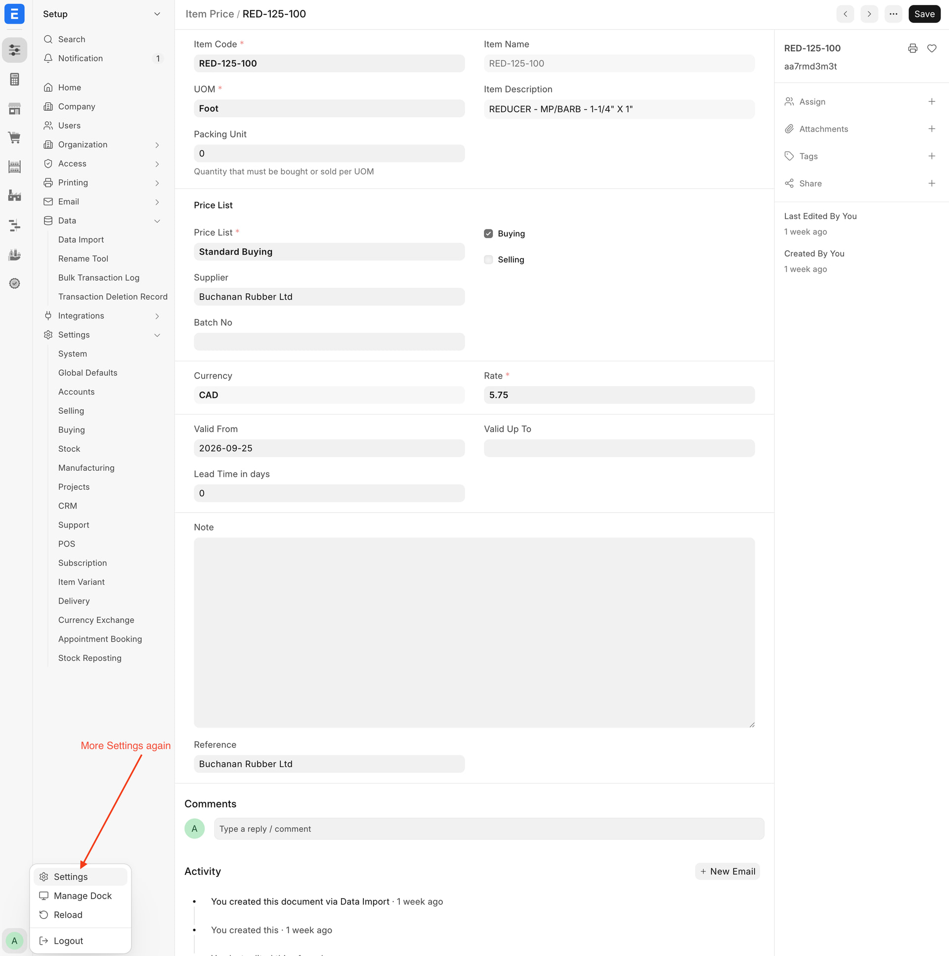
It’s just mind blowing about how “Settings” are thrown all over the place and it’s just beyond imagination for a business user to make sense of it or find a setting (I know CMD+K and the “awesome bar” exists, but that’s not the point here).
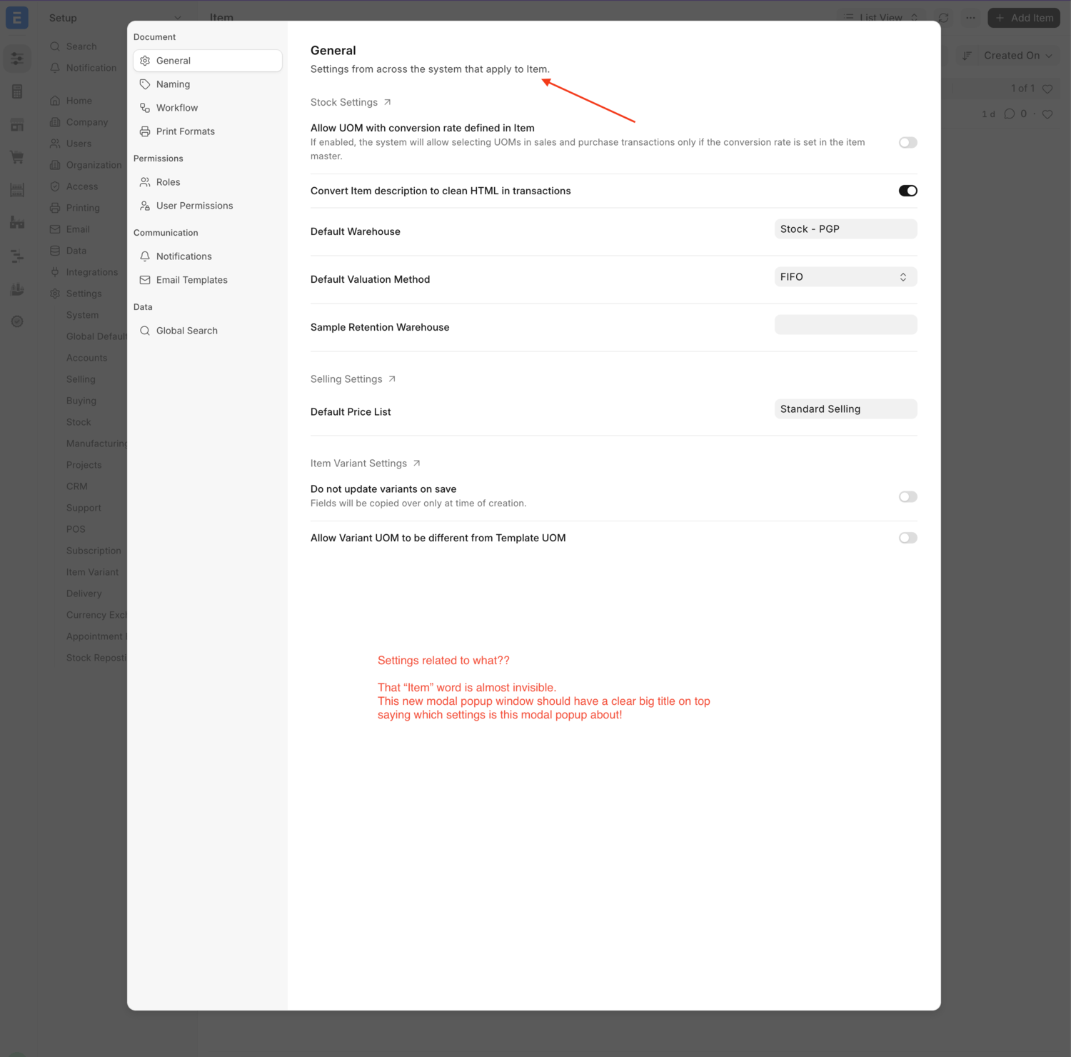
We have the new Settings modal pop-ups like this
It doesn’t mention anywhere on that modal what settings, whose settings am I editing? It has a small “Item” doctype mentioned in small letter and that’s it. It’s confusing to make sense by just glancing at it.
The we have more settings
Even more Settings
And even more Settings!!!
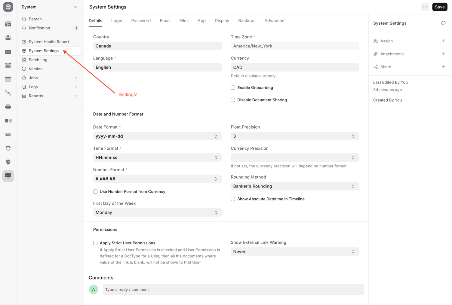
It just doesn’t stop! There are more than a dozen “Settings” spread across the whole system.
At some places the same screen has different menu names.
For eg:
We can go to Framework → System → System Settings
We can go to ERPNext Setup → Settings → System
Both show the exact same screen of “System Settings” but the menu calls it “System Settings” and “System”. It’s just ridiculously confusing for the end user
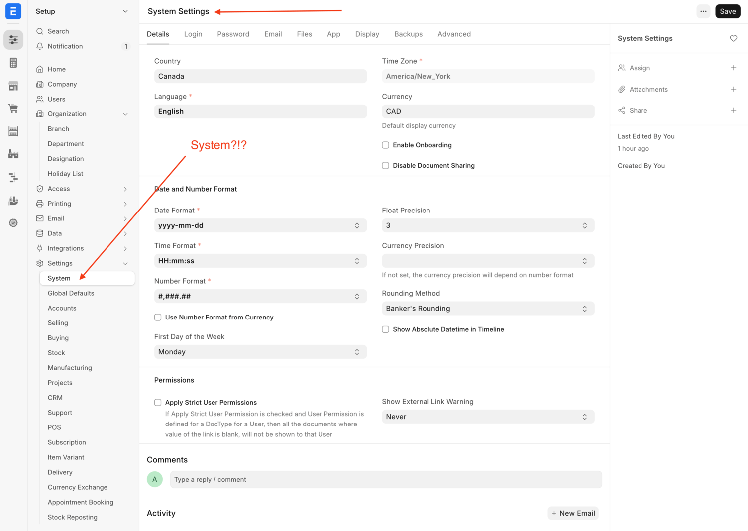

I fully understand that such a huge ERP system cannot have a single, global “Settings” section but it also doesn’t have to be so complicated. Look at Odoo or Salesforce or any other business system that has many modules. It’s simple - one global system settings and then multiple “module specific settings” screen. ERPNext already have module specific settings in place but that has to be well organized and not thrown around at random places across the system.
The new Roles & Permissions screen
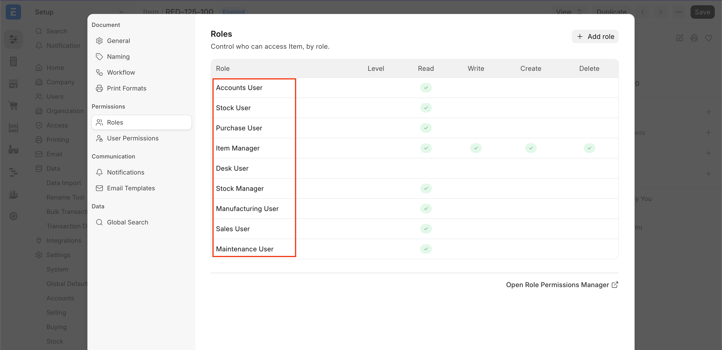
The new Roles idea is good and easy to understand visually. However when I click any of the roles, it shows the exact same modal again.
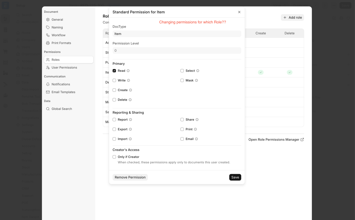
The second ovelay modal (sub-modal?) that shows does not mention which role am I changing the permissions for?
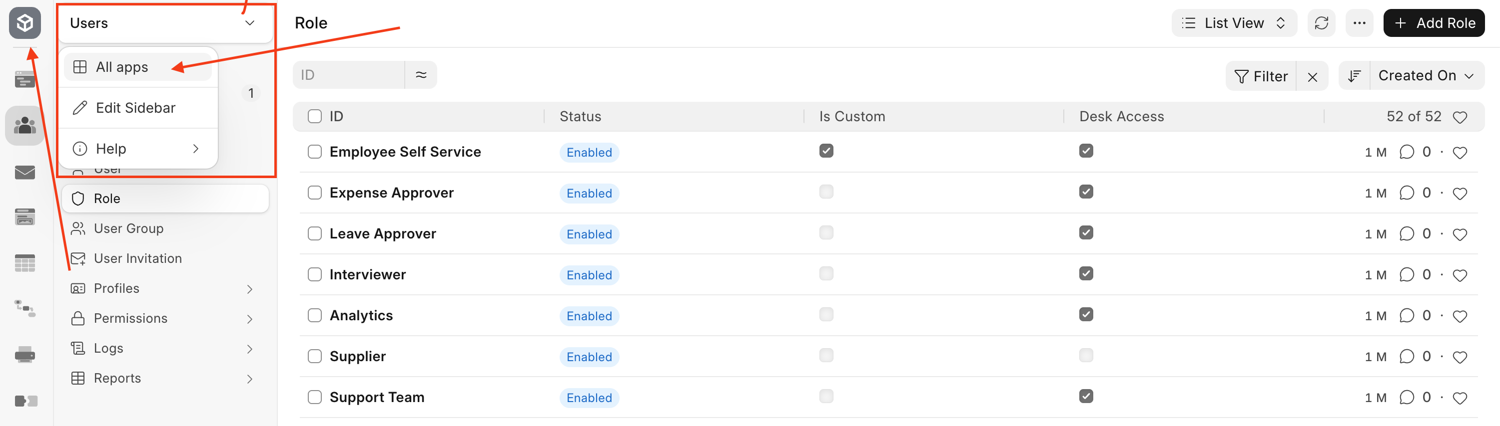
Apps / Modules Switcher? Confusion!!
Look at these screens and see how inconsistent the whole “App” or “Module” switchingh experience is. Users are just confused about what they’re clicking and where they’re going. It’s just super confusing.
Here’ the “All Apps” and the “Logo Icon” takes you to th exact same home screen “desk” page. So why have two different things??
Then we have this mess where we see “Modules” as well as “Apps” and the “All Apps” now goes under “Apps” menu
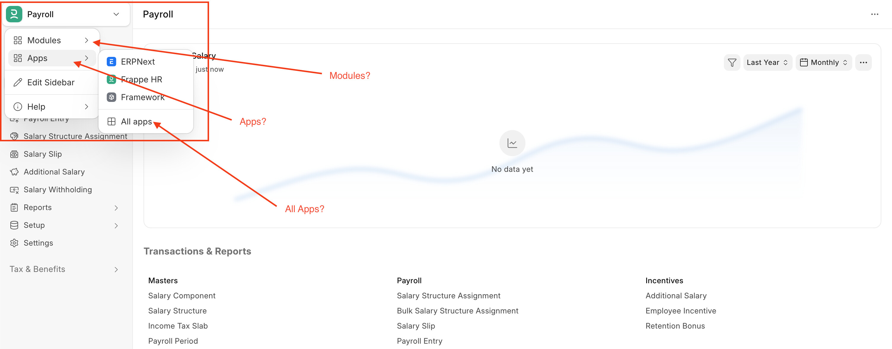
And then we also have a “Frappe HR” under Apps, and also a “HR” under Modules!! Can it get even more confusing?

I had pointed this exact thing last year when Rushabh annouced v16.
This same thing happening again with 10x more confusion now
Other issues
There are 100’s of other such confusions related to navigating the system.
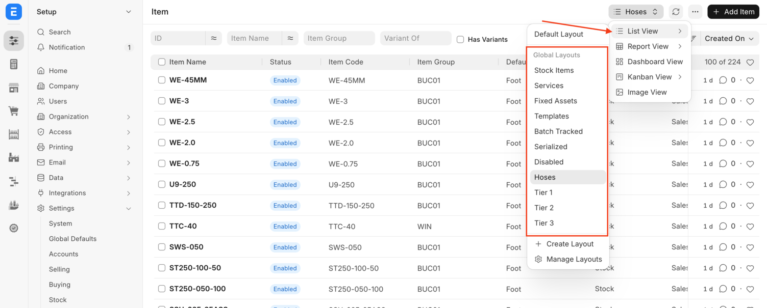
For eg, some features that were working fine were moved around unnecessarily and are now hidden. Best eg, is the “Saved Filters” dropdown on list views. Those are now hidden behind the “View Selector”. Why??? Let the view selector and saved filters be separate like it was before. Why add more layers of complications and confusion??
I understand the intention behind the new “layouts” feature but why add unnecessary complication and remove something that was previously working like saved filters?
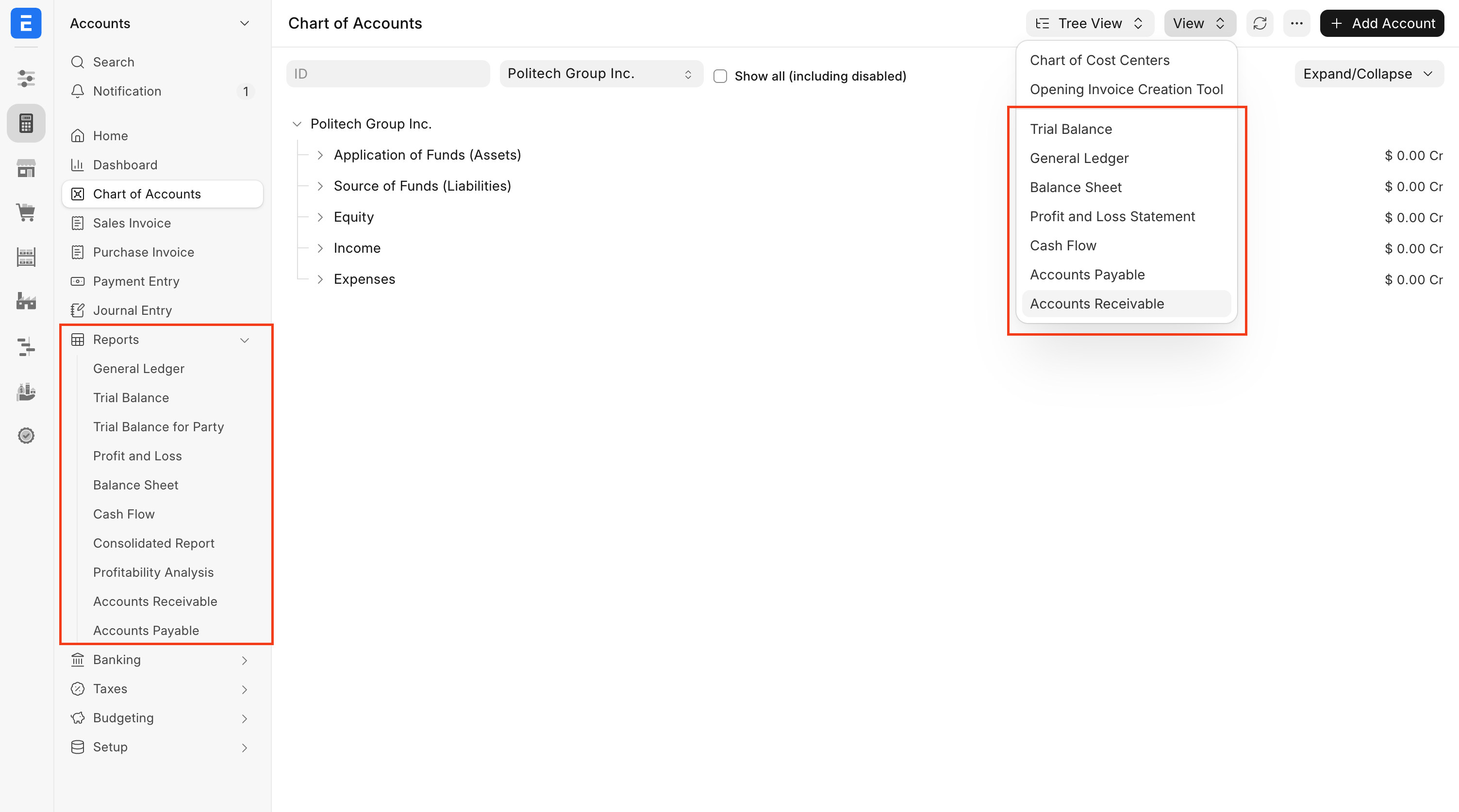
Then we have things like redundant reports showing at different places on the same screen. Why?? Why clutter the UI more with more menu items? As it is the system already has hundreds of menu links so why add more duplicates?
Like this screen showing the same Reports, whyyy add more clutter and complicate things??
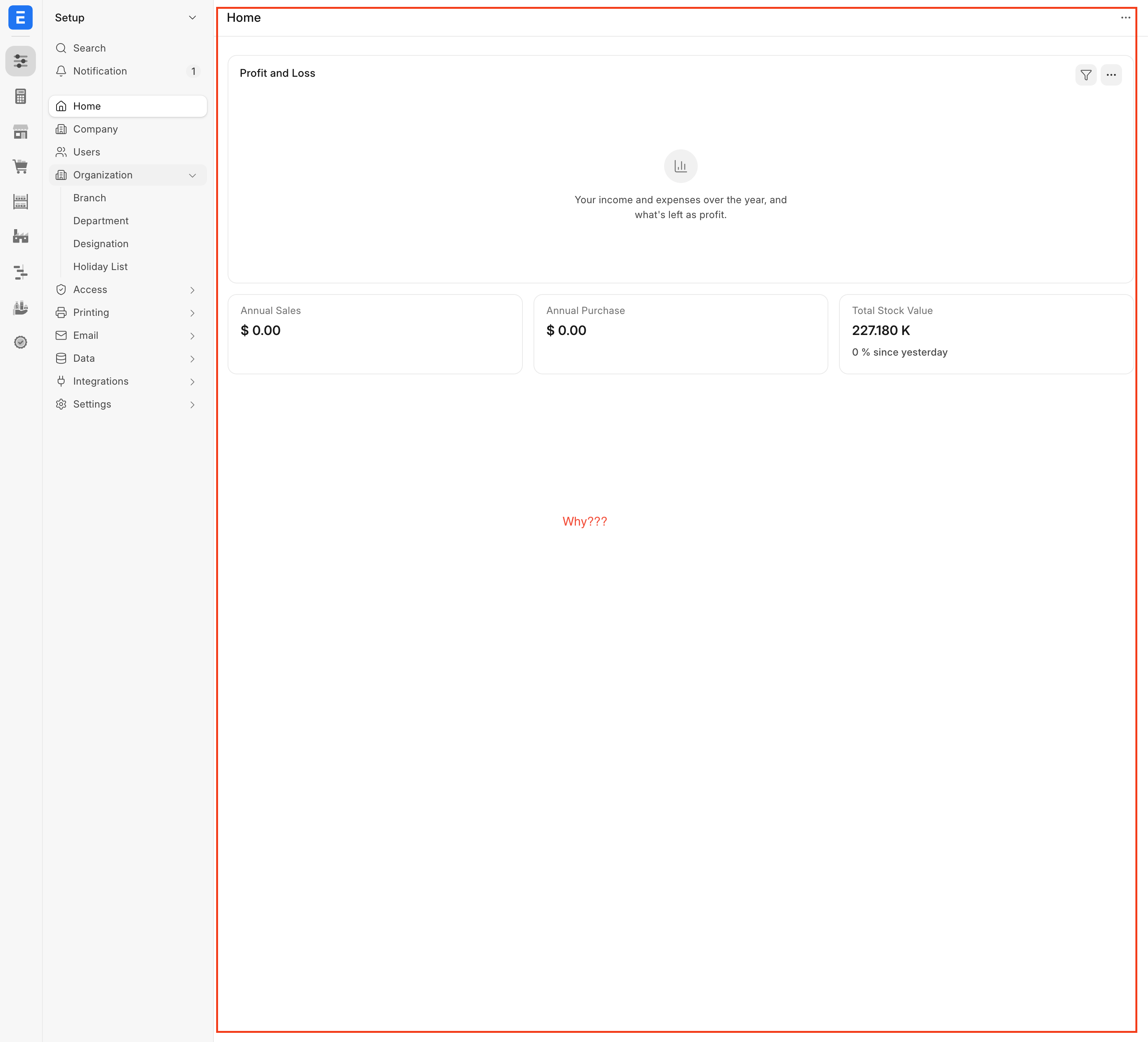
Then there are things like the “ERPNext Setup” screen has a “Home” page which shows “Accounting” related cards and numbers followed by a completely blank area? Why??
I understand the whole “everything can be customized to your liking” argument but then why not have a good enough “default” state of the system? “Default” plays a huge role in UI/UX.
I have at least 200+ more screenshots to share about such issues. I will keep updating this post as and when I get some free time to do this.
Few Suggestions
- Stop adding new navigation layers until the information architecture is revisited
- Define one consistent mental / logical model for Apps, Modules, Workspaces, Sidebar, Dock. If not, then at least have basic documentation for the end users of fundamental concepts.
- Make primary navigation persistent and predictable
- Consolidate global Settings and clearly separate them from module specific settings
- Use consistent terminology throughout the system
- Don’t hide existing functionality behind new abstractions unless there is a compelling UX benefit
- Audit the entire system for duplicate links, redundant entry points and inconsistent navigation
- Do a dedicated UX/information-architecture pass (by an agency or someone who understands design systems) before adding more navigation features
Concluding…
I am writing this post out of sheer frustration right now after having to deal with the confusion all of this has caused with real world client projects and having to defend all of these pointless UI/UX quirks and bugs.
I have worked on Frappe Framework and ERPNext since 2012 and it’s extremely annoying to see all of this (pardon my words) but enshittification going on in terms of UI/UX in the system. It’s an extremely powerful system but the lack of good UI/UX is severely hampering its adoption at larger corporations and I say that from first hand experience.
I have personally met Rushabh @rmehta, Umair @umair and the team at their Ghatkopar office and I have always admired and appreciated the high quality of work they have shipped out year after year. But I am sad to say that it looks like no one at Frappe really cares about the UI/UX mess that’s going on and now it seems like everyone is only worried about solving “engineering” build problems and “optimizing perf” issues. When @nikkothari22 joined the team, I was really hoping that we would have a positive influence/impact on the design direction of Frappe’s products because he has a track record of creating really elegant and beautiful products like Raven and he has been vocal about his appreciation of Apple’s design phiolosophy and he seemed someone like who really cared about the craft and small design details that go behind great products. Unfortunately, that doesn’t seem to be happening and instead it looks like this UI/UX wreck train continues to throttle ahead full steam and only complicating things further.
It feels like Frappe’s design philosophy right now is “Complication over Simplification”. Just add layers and layers of new complications and remove things that were simple and working.
Also, for the love of god please introduce some colors and visual hierarchy in the system. It will help the end users 100x. No end-user cares about Shadcn or Tailwind or the latest design trends in the dev world. They care about a system that works for them and gets the work done. I feel foolish to even talk about Accessibility guidelines at this point so I won’t go there.
Recently, Shopify did a full revamp of their admin UI after many many years. They did introduce the “dock” but they have done a really great job in simplifying the navigation and it all looks clean, logical and beautiful. Just take a look at the way it was handled thoughtfully and with user-first approach.
Here: The Shopify admin, redesigned (2026) - Shopify
I really hope going forward, Frappe brings onboard someone who has a good understanding of product design, UI/UX principles, business users-first approach or at least they hire a professional design agency like Timeless like they did in the past. Relying on developers to come up with solutions to UI/UX design problems is not going to work as can be seen in the last 2-3 years.
And finally I apologize in advance if any of my words or criticisms have hurt anyone’s feelings. That is not my intention at all. This comes purely from years of caring deeply about Frappe and ERPNext and wanting to see the products continue to get better.