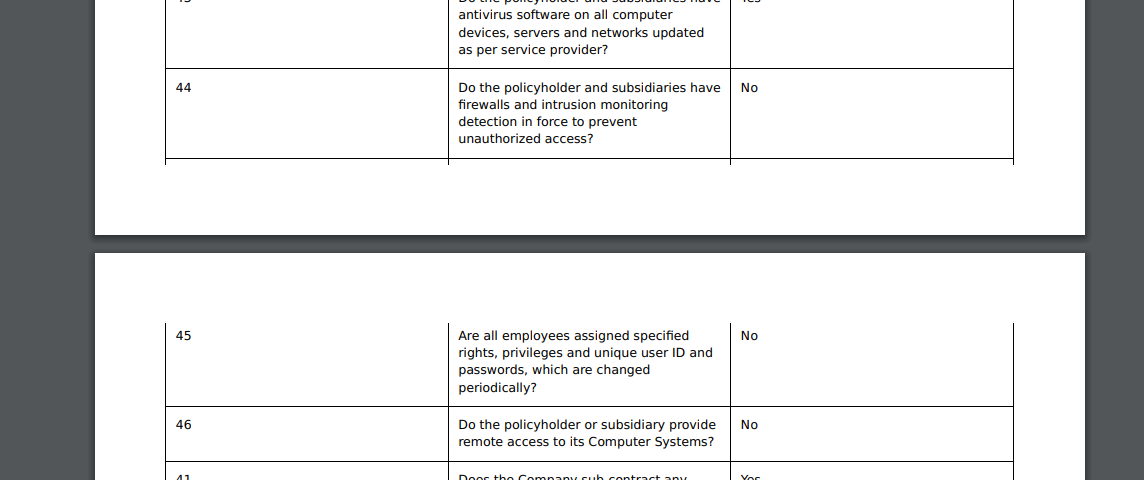
I need to print a large HTML table because of a project I have. The table’s printing across 4 pages It will occasionally split a row in half, rendering one half on the bleeding edge of the page and the other half printed at the top of the following page, rendering it unreadable. I added the page breaks for tr ,td and div in the that html template but it didn’t works.
Use the below code in CSS
`<style>
@media print {
    tr {
page-break-inside: avoid;
}
    thead {
display: table-header-group;
}
}
</style>
`
Hi @BalaV,
Please check it.
<style>
@media print {
  .page-break {
    page-break-before: always;
  }
}

.table-wrapper {
  width: 100%;
  overflow-x: auto;
}

.my-table {
  table-layout: fixed;
  width: 100%;
}

.my-table tr {
  page-break-inside: avoid;
  page-break-after: auto;
}

.my-table td {
  word-break: break-word;
}
</style>

<div class="table-wrapper">
  <table class="my-table">
    <tbody>
      <tr>
        <td>Row 1, Cell 1</td>
        <td>Row 1, Cell 2</td>
      </tr>
      <!-- more rows -->
    </tbody>
  </table>
</div>
Please set your code according to the scenario.
I hope this helps.
Thank You!
1 Like
Hi @Rahul-R @NCP thanks for the suggestion i tried the code you shared but the row are still getting break and i shared the code i tried and i just added the borders to it.
<!DOCTYPE html>
<html lang="en">
<head>
    <meta charset="UTF-8">
    <meta name="viewport" content="width=device-width, initial-scale=1.0">
    <title>Document</title>
    <style>
        @media print {
          .page-break {
            page-break-before: always;
          }
        }

        .table-wrapper {
          width: 100%;
          overflow-x: auto;
        }

        .my-table {
          table-layout: fixed;
          width: 100%;
        }

        .my-table tr {
          page-break-inside: avoid;
          page-break-after: auto;
        }

        .my-table td {
          word-break: break-word;
            border: 1px solid black;
        }

        .my-table   thead {
display: table-header-group;
}
        </style>
</head>
<body>
    <div class="table-wrapper" >
        <table class="my-table">
          <tbody>
            <tr>
              <td>1</td>
              <td>row one</td>
              <td>{{doc.row_one}}</td>
          </tr>
          ...
         </tbody>
        </table>
      </div>
</body>
</html>
Hi @BalaV,
Please try it.
<!DOCTYPE html>
<html lang="en">
<head>
    <meta charset="UTF-8">
    <meta name="viewport" content="width=device-width, initial-scale=1.0">
    <title>Document</title>
    <style>
        @media print {
          .page-break {
            page-break-before: always;
          }
        }

        .table-wrapper {
          width: 100%;
          overflow-x: auto;
        }

        .my-table {
          table-layout: fixed;
          width: 100%;
        }

        .my-table tbody tr {
          page-break-inside: avoid;
        }

        .my-table td {
          word-break: break-word;
          border: 1px solid black;
        }
    </style>
</head>
<body>
    <div class="table-wrapper">
        <table class="my-table">
          <tbody>
            <tr>
              <td>1</td>
              <td>row one</td>
              <td>{{doc.row_one}}</td>
            </tr>
            <!-- more rows -->
          </tbody>
        </table>
      </div>
</body>
</html>
Hi @NCP I altered the code with the code you shared but still it getting break.! 
Please check it.
<body>
    <div class="table-wrapper">
        <table class="my-table">
          <tbody>
            <tr>
              <td>1</td>
              <td>row one</td>
              <td>{{doc.row_one}}</td>
            </tr>
            <!-- more rows -->
            {% for row in doc.rows %}
              <tr>
                <td>{{ row.field1 }}</td>
                <td>{{ row.field2 }}</td>
                <td>{{ row.field3 }}</td>
              </tr>
              {% if loop.index % 10 == 0 %}
                <tr class="page-break">
                  <td colspan="3"></td>
                </tr>
              {% endif %}
            {% endfor %}
          </tbody>
        </table>
      </div>
</body>
After every 10 rows, a tr element with the class “page-break” is inserted, acting as a manual page break. The colspan=“3” attribute ensures the row spans across all columns.
Adjust the number 10 in the {% if loop.index % 10 == 0 %} condition based on the number of rows you want to display on each page before a page break.
Although this method is not ideal, it provides a workaround for manually adding page breaks.
I hope this helps.
Thank You!
1 Like
Thank you @NCP  but the table have nested tables in some row which is only getting the dynamic values. so I planned to put the nested tables in bottom of the main table to reduce the row breaks in the top by giving manual page break.