Why would we want a logo that is detached from ERPNext’s logo. This makes very little sense to me.
3 Likes
My choice is Option 3…

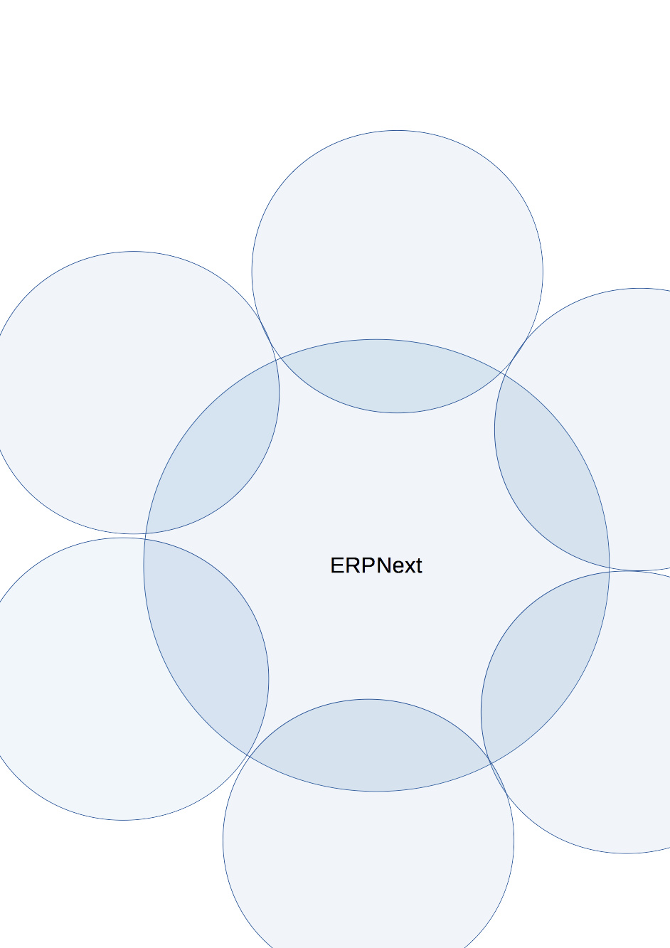
I would like to propose an image which were used to define the future of foundation. Which has ERPNext Foundation in center as a big circle and there are communities including ERPNext as smaller circles all around.
Something similar to…
1 Like
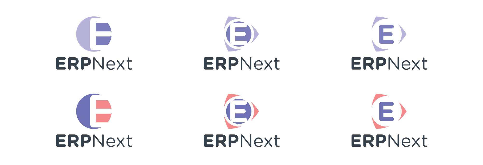
I like option 1 with the ERP font similar to the Next font.
1 Like
Do the Circles on Options 1,2,3 have meanings?
What about the colors ?
Letters are ok either option 1 or 2
Option 1 looks good. Also we can incorporate Jay’s suggestion to have same font for ERP and next. Maintain the same classic violet color.
In design point of view, as mentioned by JayRam, the font should be the same font.
Every color and shape must bring some meanings. This will help them foundation growth in the future together with the logo.
What about moving the 3 circles behind ERPNext? and adding foundation text under it? just a thought…
Do we need a new logo right now?
Maybe a logo should be about last thing on a design groups current list of things to do?
I personally feel:
The current visual identity of ERPNext Foundation should be it’s product.
This is the only branding worth anything at present.
All foundation design efforts should be put into UI/Usability and Customisation.
I do love some of the creative ideas above.
Maybe we could add a whiteboard/visual design collaboration page within the foundation’s ERP. A page where people can pin up different visual ideas and get feedback. The ability to star or vote on differing designs would be excellent. Does anyone know of a open source solution that would be fast to implement in Frappe/ERPNext? It could even be a 3rd party solution.
1 Like
Some thoughts here:
-
Keep the logo uni-colour sort of close to the actual logo.
-
Add the word foundation in thin font and small caps below ERPNext (which I agree should be same size/style) i.e. FOUNDATION
-
Drop the circles and go for block shapes 2-D layered transparently which would represent developers/implementers/users on top
1 Like
I totally agree with you,
This isn’t a foundation-led effort.
None of them give me the whowwwww…Magic overflow is nice…Let just wait a bit…One can not change a logo yearsly
I like the option 2 personally
Hey Jayram,
Thanks for the feedback. This is doable and I am working on it.
We tried this in the initial discussion internally, I and some others felt that it looks like olympic logo, so we dropped that option.
As Rushabh said this is the logo for the foundation.
Thanks again for the feedback.
This idea very nice, I will certainly explore it, but in my initial sketches this looked similar to google drive logo, which is also a triple mobius.
Wow thanks for the designs!
1 Like