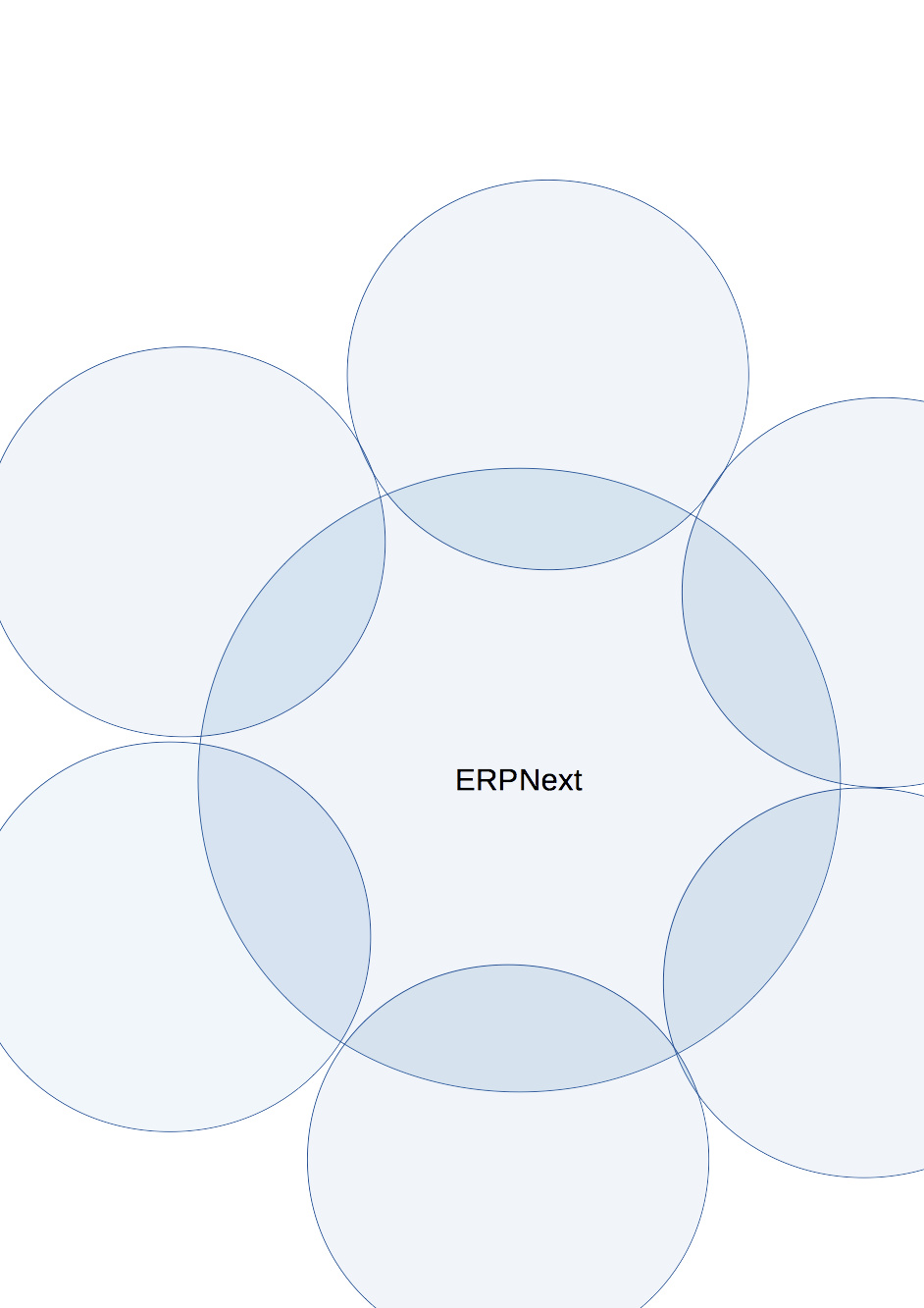
I would like to propose an image which were used to define the future of foundation. Which has ERPNext Foundation in center as a big circle and there are communities including ERPNext as smaller circles all around.
Something similar to…
1 Like
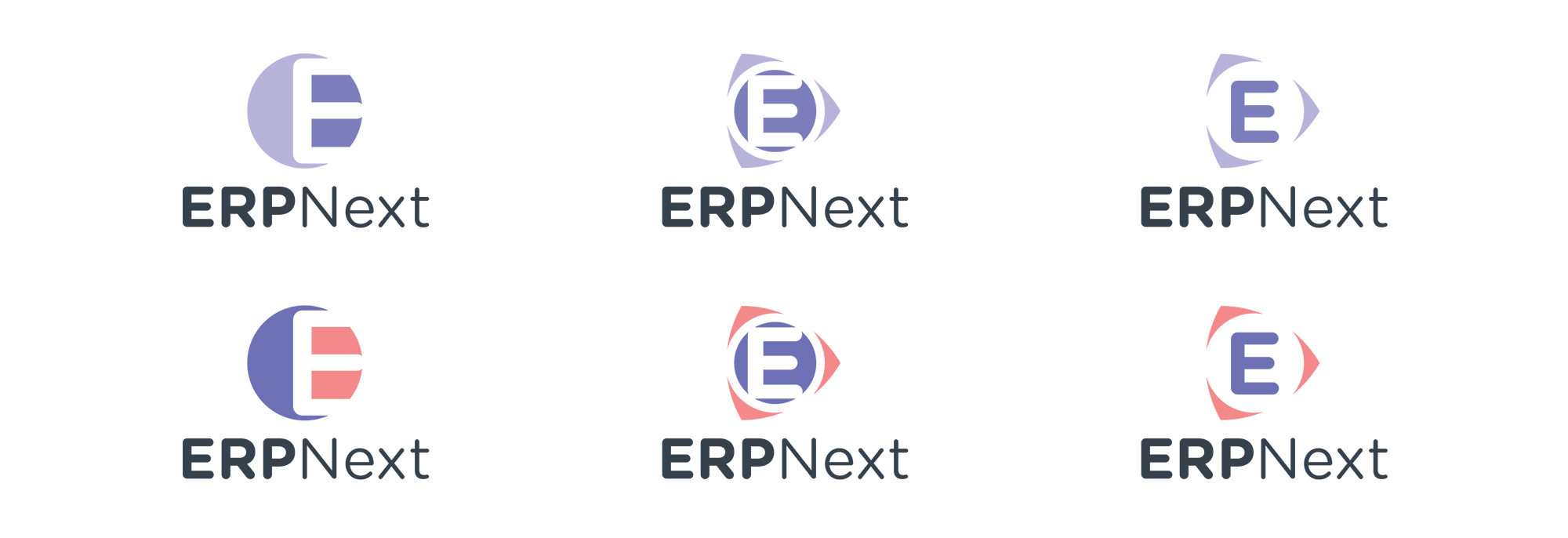
I like option 1 with the ERP font similar to the Next font.
1 Like
Do the Circles on Options 1,2,3 have meanings?
What about the colors ?
Letters are ok either option 1 or 2
Option 1 looks good. Also we can incorporate Jay’s suggestion to have same font for ERP and next. Maintain the same classic violet color.
In design point of view, as mentioned by JayRam, the font should be the same font.
Every color and shape must bring some meanings. This will help them foundation growth in the future together with the logo.
What about moving the 3 circles behind ERPNext? and adding foundation text under it? just a thought…
Do we need a new logo right now?
Maybe a logo should be about last thing on a design groups current list of things to do?
I personally feel:
The current visual identity of ERPNext Foundation should be it’s product.
This is the only branding worth anything at present.
All foundation design efforts should be put into UI/Usability and Customisation.
I do love some of the creative ideas above.
Maybe we could add a whiteboard/visual design collaboration page within the foundation’s ERP. A page where people can pin up different visual ideas and get feedback. The ability to star or vote on differing designs would be excellent. Does anyone know of a open source solution that would be fast to implement in Frappe/ERPNext? It could even be a 3rd party solution.
1 Like
Some thoughts here:
-
Keep the logo uni-colour sort of close to the actual logo.
-
Add the word foundation in thin font and small caps below ERPNext (which I agree should be same size/style) i.e. FOUNDATION
-
Drop the circles and go for block shapes 2-D layered transparently which would represent developers/implementers/users on top
1 Like
I totally agree with you,
This isn’t a foundation-led effort.
None of them give me the whowwwww…Magic overflow is nice…Let just wait a bit…One can not change a logo yearsly
I like the option 2 personally
Hey Jayram,
Thanks for the feedback. This is doable and I am working on it.
We tried this in the initial discussion internally, I and some others felt that it looks like olympic logo, so we dropped that option.
As Rushabh said this is the logo for the foundation.
Thanks again for the feedback.
This idea very nice, I will certainly explore it, but in my initial sketches this looked similar to google drive logo, which is also a triple mobius.
Wow thanks for the designs!
1 Like
I realize it could look like the Olympics’ or Audi’s logo. What’s the harm in that?
I think we have to also think about how easy and inexpensive it would be to transfer those prints on paper, merchandise, etc.
From that perspective, just the borders being colored may be a better idea. The fewer colors the better of course!
Let’s give that a thought before we select the final logo.
Thanks
1 Like
Considering the popularity of the first option, suggestions for @JayRam and others to keep the text of same weight and keeping the circles as only borders, I tweaked the designs. I can say that I am happy with the results. Here is the design.
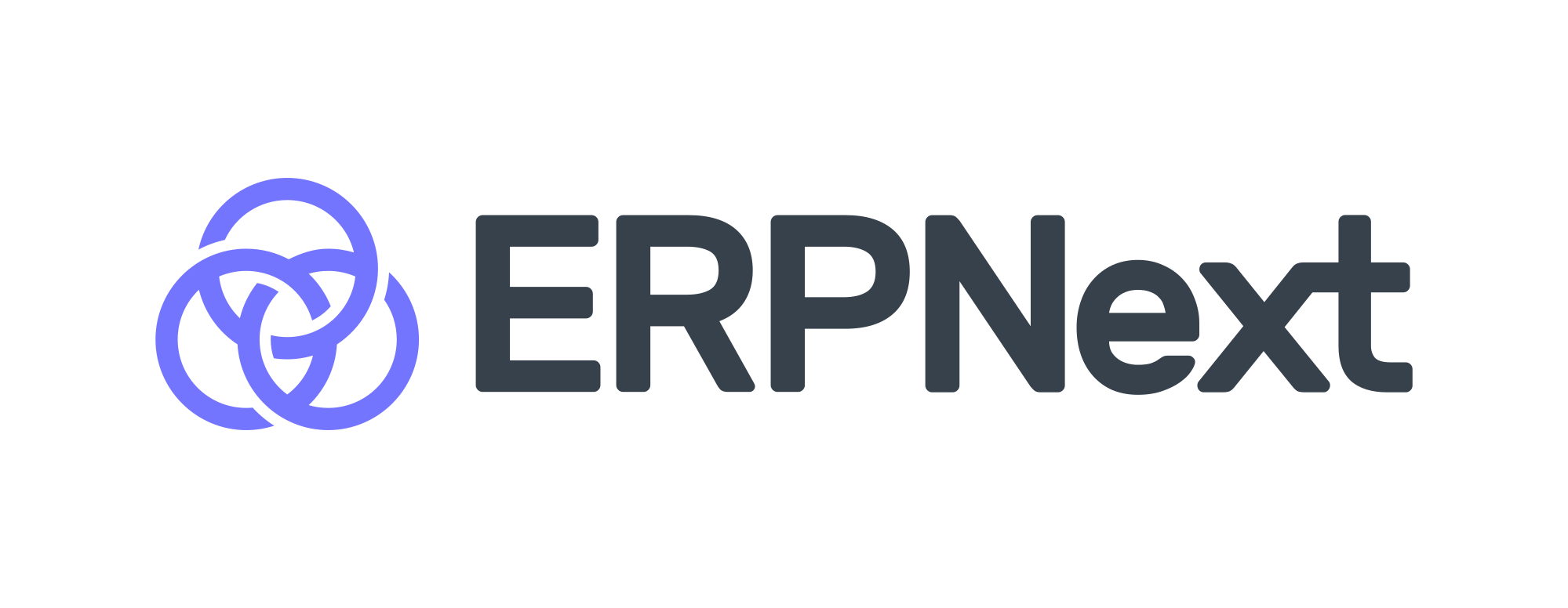
I have written some guidelines for the use of the logo, It can be found here . The guidelines is still WIP and there is lot to add in that.
Also to check the progress of any design job check the design repo, the repository is new and it will be reorganised soon.
Thanks
7 Likes
Looks good. I like the slim font. This font is too thick. Can we make the circles contiguous instead of those breaks when they cross over? Can we separate out the x & t? I think it confuses people that its connected together.
But as somebody vehemently complained to me, this creativity by committee business is bullcr@p.
So based on all inputs given to you, you internalize which ones you want to take and which ones to ignore and come up with a final design and tell everybody: This is it, guys! Take it or get somebody else to do it for you. ![]()
Cheers
Jay
1 Like
I kept it medium because at smaller sizes redability diminishes, it seems thick because the image is big.
This is on purpose ![]() just like a ligature in handwritten text.
just like a ligature in handwritten text.
Thanks for the valuable feedback. Design is subjective and one needs feedbacks and critiques to make it apealing for everyone.
I would need help in writing the guidelines (brand guidelines or rules to use the logo), I have written most of it, but would need more information on guidelines for use of logo by service providers and partners. I’ll finish the document and put it on the forum here. If you want a sneak peek check out the design repo.