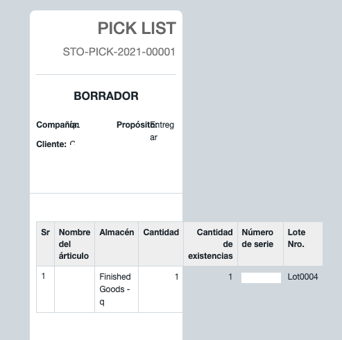
Hello, I want to customize a report (pick list), I’m using a thermal printer with PDF format, I added a custom CSS table responsive, but it is not working at all, we are looking a better way to show the information in vertical instead horizontal view, for our purpose, is there any solution ? thank you

hi @Jonathan_Sa
For a format as shown above, its best not to use a table.
You could use the bootstrap cards
Thanks @centaur for the recommendation, but I don’t see any variables for that specific report, I used the same code I did for sales order, but this is the reason I’m having troubles with it. Could you share a code for pick list report?
Thank you
hi
I am assuming you want the code for the print format of Pick List…
If so could you paste here the custom html code you have used to make the print format ??
Yes, it is a simple CSS code to get the format to printer, but I’d help me that table become in cascade instead of. Maybe the invoice document can works with our requirement, because is missing the expiry date in the document,
Thanks in advance,
 <style>
.print-format table, .print-format tr,
.print-format td, .print-format div, .print-format p {
	line-height: 150%;
	vertical-align: middle;
}
@media screen {
	.print-format {
		width: 2.3in;
		padding: 0.1in;
		min-height: 8in;
	}
}
hmmm
Thats only the CSS… which means you are using the Print format Builder
You would most probably need to use custom format to get the print format that you want.
-
Create a new print format for pick list and select “custom format”
-
Use the below sample code for the html … though this is just an example… you can use fields from the Pick List and Pick List Item Doctype to get fields you wanted printed. Use the necessary CSS to format as well.
{% macro above_items() %}
<div class="container-fluid">
    <div class="row">
         <div class="col-xs-12">
            <h3><b>PICK LIST</b></h3><br>
            <p>{{ doc.name }}</p>
        </div>
    </div>

    <hr style="margin: 0px;">

    <div class="row">
       <div class="col-xs-12">
          <p>Company  : {{ doc.company }}</p><br>
          <p>Purpose  : {{ doc.purpose }}</p><br>
          <p>Customer : {{ doc.customer }}</p>
       </div>
    </div>

    <hr style="margin: 0px;">

    <div class="card" style="width: auto;">
          <div class="card-body">

{% endmacro %}

{% macro below_items() %}
        </div>
    </div>
</div>

{% endmacro %}


{% for page in layout %}

{{ above_items() }}
 {% set pr = [1] %}
 {% set lines = [0] %}
     {%- for row in doc.locations -%}
             <ul>
                 <li>Sr.         : {{ row.idx }}</li>
                 <li>Item Name   : {{ row.item_name }}</li>
                 <li>Warehouse   : {{ row.warehouse }}</li>
                 <li>Qty         : {{ row.qty }}</li>
                 <li>Stock Qty   : {{ row.stock_qty }}</li>
                 <li>Serial no.  : {{ row.serial_no }}</li>
                 <li>Batch no.   : {{ row.batch_no }}</li>
             </ul>
     {%- endfor -%}
{{ below_items() }}

{% endfor %}