As I delved into a significant project for an engineering company—navigating the complexities of distributed manufacturing—the quest for an optimal project management tool led us to develop a tailored solution atop Project Doctype. This involved crafting custom doctypes, particularly with intricate child tables containing nearly 50 fields to meticulously capture manufactured item details. Imagine the challenge—each user often faced the task of creating around 20 entries in one go!
The Epiphany Moment
Engrossed in trialling our newly built system, I encountered the inevitable— data entry overload. Despite my profound admiration for ERPNext, the sheer volume felt daunting. That’s when the spark ignited—was there an alternative that could streamline this process? Seeking inspiration beyond our realm, I explored how other digital products effectively manage such intense user experiences.
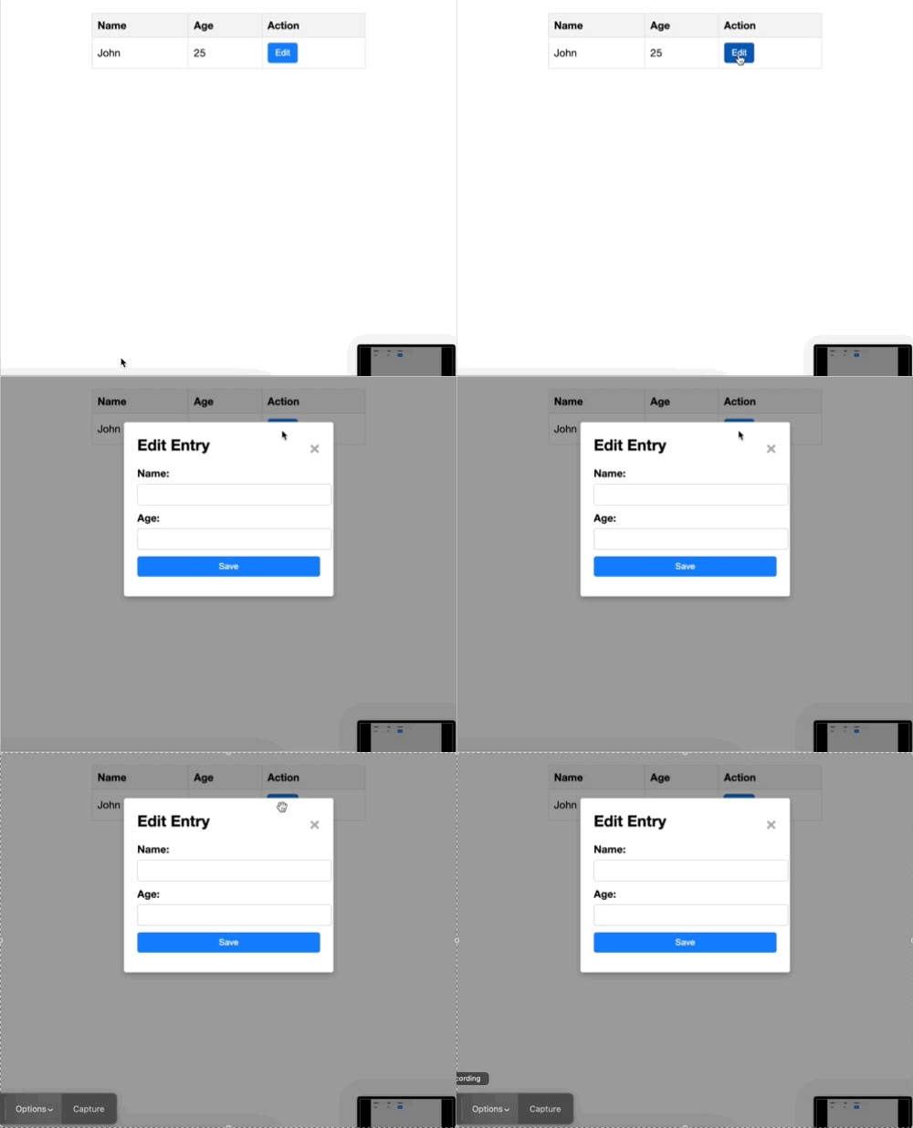
The UX Showdown: Modal vs. Right Side Pane
Modal-Based UX:

Pros:
- Streamlined, focused interaction.
- Clarity in task separation.
- Clean and succinct interface.
Cons:
- Potential context switch confusion.
- Space constraints for extensive data input.
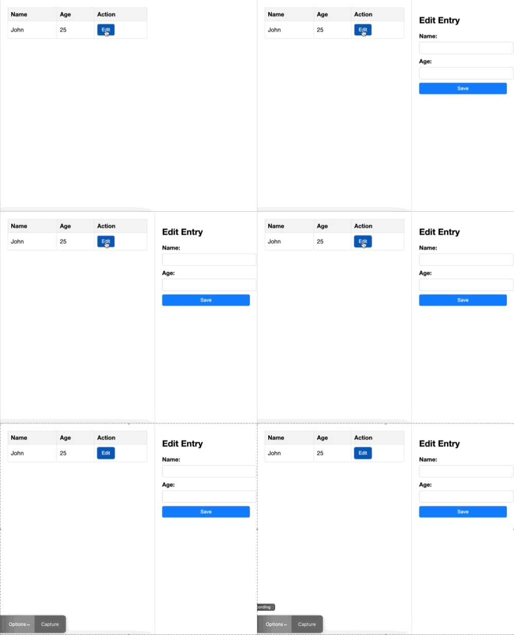
Right Side Collapsible Pane-Based UX:

Pros:
- Retained context with simultaneous viewing.
- Expanded space for comprehensive input.
- Consistent visibility across tasks.
Cons:
- Risk of space limitations.
- Balancing focus in dual-pane layout.
- Complexity in managing responsiveness.
I found that Side Pan UX has better navigation capabilities and a unified view of the whole document that you are working on. And certainly, I think that this can hugely cut the data entry overload.
I request all the Fellow members, your expertise and perspectives are crucial in shaping this crucial discussion. What’s your take on these contrasting UX approaches? Join in, share your insights, and let’s collectively enhance the user experience in our ERPNext.