@rmehta, Looking at current discussion status I would like to understand your view.
How about proceeding with Approach 1 in this scenario?
@gupteshwar You are almost there with Approach 2 - are you facing any problem? Its just about the HTML template
Edit: With Apporach 1, you will have to re-create filters, deletion and other features too.
@rmehta, agreed and we are confident but image size is the only concern. I
think we may not be able to achieve beyond this size as overall look
disproportionate.
Thanks and Regards,
Gupteshwar Joshi
Cell: +91 997 016 0421 | Off. : (20) 657 0800 | Skype : gupteshwar.joshi
@rmehta, let me clarify, please. Among the size of thumbnails in the original mock-up and the size of thumbnails in POS view, do you consider either of them as acceptable?
Addition: I assume we are talking about thumbnails in the item list, switched to “image view”, but not generic “list view”. And hope there is no intention to remove generic “list view”, as it’s really useful for those, who don’t have images, or want to reduce traffic consumption on limited bandwidth.
@strixaluco the POS view CSS can (should) be incorporated in this view
(We must use the same CSS and not duplicate it!)
@rmehta, sure, I definitely agree that there shouldn’t be any redundancy.
So, summarizing, the plan is to follow Approach 2, implementing optional switchable image view with the CSS of the POS view. Is it correct?
So, confirming the approach here,
- Legacy list view is available with configuration.
- User can change configuration to switch to image view instead by wish.
- User will have an option to choose two columns to be shown with image view.
- That specific item view changes to image tiled view with 2 column values.
** Will think of more column later may be as of only 2. - User has choice to switch back to list view and back once configuration for image view is set for listing.
- Rest other listing will be available as only list view until configured for image view.
Looks great, @gupteshwar. Please try to incorporate 3 column values, if it’s possible. Thank you.
@rmehta
Hello guys,
Just an update on Image view feature.
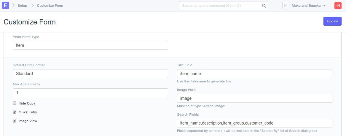
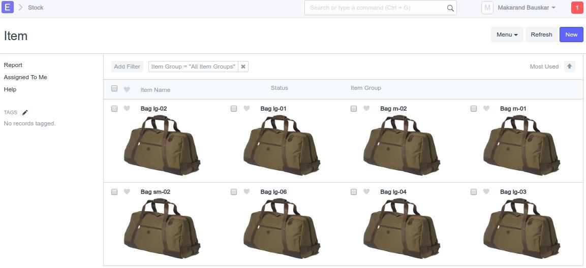
We have configured the flag on both doctype and customize form if user wish switch from List view to Image view or from Image view to List, user will need to check/uncheck the Image View option
Here is the screen shot for the Image View.
Thanks,
Makarand
Hi, @makarand_b. The size of the images seems good. Thanks a lot for the update!
Just two questions:
- is it possible to create a toggle switch, as was discussed in the post #2?
- is it a preliminary mock up? We expected that there will be 3 or at least 2 column values in the Image view (Item name, Item group, Date of submission).
Thanks.
@strixaluco, yes currently we are working on the layout fixes.
- Toggle switch we will be thinking to add as a last activity.
- This first cut of layout only for reference.
@strixaluco, Proposing to show additional column values on mouse hover to item.
This is in interest to see the relevant details without disturbing the layout much.
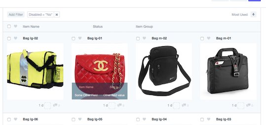
Interesting. Let me discuss this with our designers. What about Frappe team opinion on this?
Addition: how is hovering supposed to work with mobile devices?
Hello Guys,
Just an update on Image View feature,
We have completed the Phase 1 of the feature and its under testing,
So far we have covered the
-
Image View and switching in-between the List View and Image view through Customize View,
-
Checking and Unchecking the of all items from Image View and the operations like Assign to and Delete
-
Applying filters, Likes and comment count
For, Second phase (Image Zoom view) we are trying to integrate the [gallery] (GitHub - blueimp/Gallery: blueimp Gallery is a touch-enabled, responsive and customizable image & video gallery, carousel and lightbox, optimized for both mobile and desktop web browsers. It features swipe, mouse and keyboard navigation, transition effects, slideshow functionality, fullscreen support and on-demand content loading.) plugin. We are going to fetch and render a list of images associated with the item from File Doctype.
Now, our primary concern is how to separate the text documents from Images attachments.
as for now, there is no flag to whether it is an image file or not.
@rmehta any suggestions ?
Thanks,
Makarand
@makarand_b send the PR. Let me see the code
I agree more values should be on hover. Item image and name are all that is required in the grid view.
Great news, @makarand_b! Thank you. Any new mock-ups?
If possible, please facilitate and unify this approach for using with Bulk upload feature, as we discussed with @gupteshwar.
Hi,
The image view part of the feature is completed and pushed on image-view but, I am currently working on the plugin integration once completed i will send the PR.
Thanks,
Makarand
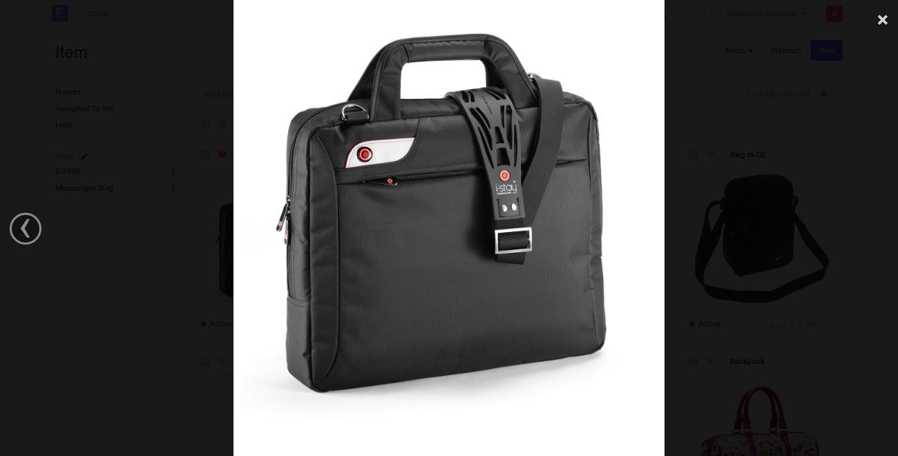
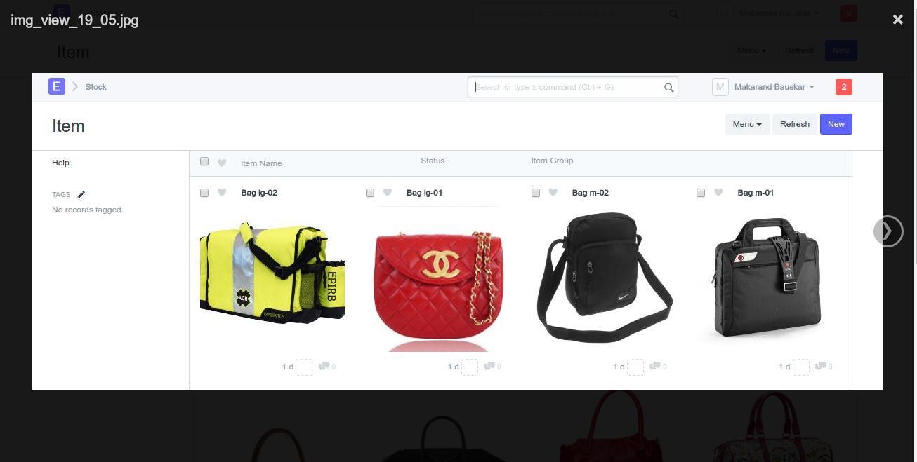
Update, Image zoom view is still in progress. please check the below mock-ups, currenlty we are able to display full-size image whenever user click on the image from Item Image View.
Image 1
Image 2
The user can navigate through the Images for the same item using Previous and Next arrow keys. On Esc click user will go back to Image View.
Kindly share your thoughts and suggestions.
Thanks,
Makarand
