Erpnext 16 Beta Version, and the UI and performance improvements are impressive—thank you to the team for the great work. However, the navigation between modules and doctypes feels confusing.
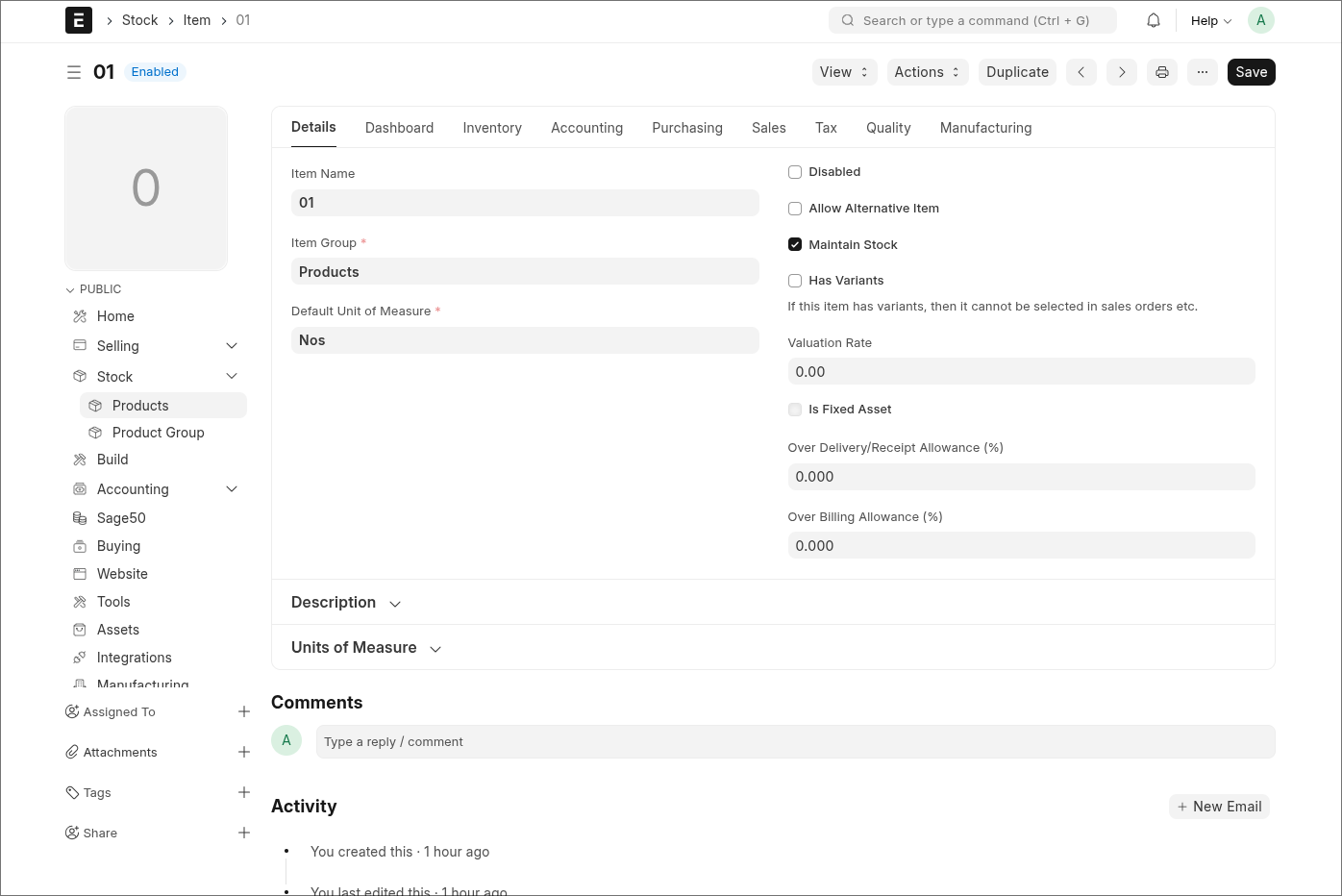
For example, when I’m in the Selling module, the left sidebar correctly shows Selling-related items. But if I click a link in the sidebar that belongs to another module, the sidebar switches to that module and then opens the doctype. This makes it difficult to stay oriented. Additionally, returning to the previous module isn’t straightforward.
Another usability issue is that returning to the Desk requires clicking twice, which doesn’t feel user-friendly.
I kindly request the team to review and improve this navigation flow to make the user experience smoother
I haven’t tested v16 extensively yet, so this is just an initial impression, but I agree the navigation currently feels a bit cumbersome.
The two-step process to get back to the Desk also slows things down. I’m curious why the UI shows both Website and Desk as options. In daily use, most users go straight to the Desk, not the Website. Skipping that intermediate selection and opening the Desk immediately would already make the workflow smoother.
I also find it harder to keep a sense of the overall structure between modules with the current design. The context switches quickly, and it’s easy to lose track of where you came from.
Maybe a hybrid approach could work: something closer to the previous version, where all modules were always visible in a sidebar, combined with the new idea where the sidebar shows items of the currently active module. In that setup you could click a module in the module-list sidebar, and then the sidebar transforms into the detailed view of that module. A simple “back” arrow could bring you back to the module list. That would give both a good overview and quick navigation.
Just some thoughts from early impressions, but I think improving this flow could make the UX a lot more intuitive.
I was testing the new GUI, I also often lose track of where I started because of the current UI. The previous version felt cleaner to me—I always knew where I was and where I needed to go.
With the new design, navigation feels more difficult, and finding documents can be frustrating since I often have to go back to the Desk to start over or need to search. Improving this flow would definitely make the UX much smoother and more intuitive.
Hello
My name is Soham (@sokumon). I am part of the Framework team who has done the Desktop changes. @jewel71 The issue that you are talking about can you share a video.
I think what jewel meant was, in prev version, all menu are easier to find from sidebar. even though, while navigating through doctype make people lost because it didnt maintain the navigation, but at least we still have the sidebar to go back to any doctype. i dont know how to explain this myself, but i often found myself lost. i share a video for reference here.
@mrjurin Eexactly what the video shows — when the sidebar suddenly changes, I get lost because I no longer know where I am. @sohamkulkarni plz check the video @mrjurin shared.
hi, i just want to give suggestion, maybe each path can be configured for any workspace so even though the doctype is in other app(let say app: A), it can be configured to be view in other app(let say app:B) as if the doctype is from the current workspace we are in (no workspace and menu change). the current configuration for the workspace is already tackled the link of other doctype but, the problem is that, when i click the link i configure (doctype exists in other app) it will change also the menu and workspace, make people lost while navigating. in my experience with acumatica erp, there is a configuration called site map where we can define the screen path to be viewed in specific workspace.
I agree with this. It feels odd to suddenly end up inside another app/workspace just because a linked doctype happens to live there. From a user’s perspective, it usually doesn’t matter at all in which app a doctype or report technically belongs. What matters is that related items are grouped logically under the module they’re working in (e.g. CRM, Accounting, etc.).
If a link is opened from within that module, the user should stay within that context, not get pulled into a different workspace without warning.
The same happens, for example, when opening a linked Event from an Opportunity. You open it expecting to stay within the CRM flow, but instead the UI switches to the Productivity app. There’s no visual reference back to the Opportunity you came from, which makes the experience feel disconnected. A calendar is typically opened from other doctypes; users don’t need to know (or care) that it technically lives in the Productivity app.
Allowing each path to be configured to “belong” to a chosen workspace, and keeping the user inside that workspace when navigating, would make the flow far more intuitive.
I also want to add that I can imagine the Desk with icons being a good starting point for users who mainly work in a single app. But for anyone who moves between multiple apps, it quickly becomes cumbersome and everything feels a bit disconnected.
A hybrid approach could work much better: keep the Desk and bring back a sidebar similar to the previous versions. When a user selects an app/workspace from either the Desk or the sidebar, the sidebar could transform into an overview of the doctypes and pages that belong to that app/workspace like in this beta version. With one click, you could return to the full app/workspace overview in the sidebar (or to the Desk whatever the user prefer or is configured).
I think that combined with the suggestion from @mrjurin, where paths can be configured so doctypes from other apps open within the current workspace instead of switching the entire UI, this could significantly improve the overall workflow and reduce disorientation for users.
in terms of UI and workflows, its fine, however from technical standpoint, ic an understand the complexities of achieving this coherently.
i guess this is why most systems implement a breadcrumb, that also has navigation history, which enables the system identify the source and destination, therefore making it easier to retain context based on grouping.
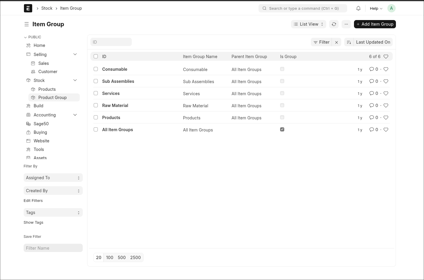
I’ve been using a global left sidebar in v15 (based on the existing Workspaces configuration), and honestly I thought this type of navigation would already be part of v16.
In v15 I reuse the Workspace menu to build a single, persistent global sidebar that stays visible in List and Form views. It gives me a stable navigation structure: all modules on the left, and each module expands into its own submenu. Users never lose context, because the sidebar doesn’t change when they open different DocTypes.
After reading the feedback in this thread, it seems that many of the navigation issues in v16 come exactly from the lack of a unified sidebar. That’s why I imagined this would be the natural direction of the new UI. A single global sidebar with module submenus feels simpler, more predictable, and avoids the “teleporting” between workspaces.
Just sharing my experience from v15, in case it helps clarify what some of us were expecting in v16.
Exactly what I wanted in the new version—just like in your screenshot. But in Version 16, the UI navigation is messed up. It’s very hard to navigate to a specific doctype, and if you want to go back to a particular Module, you have to click multiple times. Users don’t want that; they always prefer a single-click experience.
I have been doing the same. It is hard to remember all the icons - there are so many of them - so for me the value of the slim side menu is minimal. It is much easier to use the textual link tree in the global sidebar. Frappe is building some awesome productivity tools that are interconnected. I think the slim sidebar in v16 should be used to navigate between apps (CRM, ERP, HRMS, Gameplan) and retain the original v15 navigation within each app…. Don’t know how many users would agree with this….
I think the team did it this way because it should be easier to switch between apps. But now we have a problem: navigation is causing confusion because there are too many possible side navigations, and it’s not clear where you ended up after clicking some link from another app. It should be more consistent. Users should trust the side navigation.
I am not fully sure about this, but I think it might be better to wait for the official release. The Frappe team may provide updated documentation or a user manual that clarifies these changes.
It would be great if the Frappe team could give users the option to keep using the v15 navigation menu or switch to the new one. The new navigation doesn’t meet expectations, as it forces users to make too many clicks and go through excessive navigation steps.