First let me congratulate the ERPNEXT team and the community for the awesome V7.
I love what you guys did with new POS and the offline mode, that was long waited improvement. Now the POS have the functionality that most retails are looking for. However, I think in terms of usability and elegance, there is still more to be desired [Its Erpnext team fault cuz the spoils us with there elegance design and attention to details ]
I’m not expert and usability or interface design in anyway, but in current implementation the user has to take lots of steps to finish transaction and the interface mostly rely on multiple pop up boxes to do the transaction (which in term of usability is annoying to the user and should be last resource just for important alerts)
I’ve tried to put together some ideas for improved POS interface. I used Balsamiq , and I’ll attach the file so we can work together on improving it.
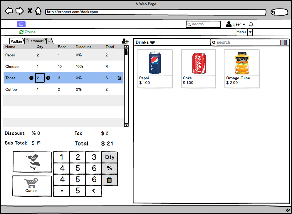
1- The main interface
- We can serve multiple customers at the same time (The number should be limited Ex.4 so we don’t have cluttered interface )
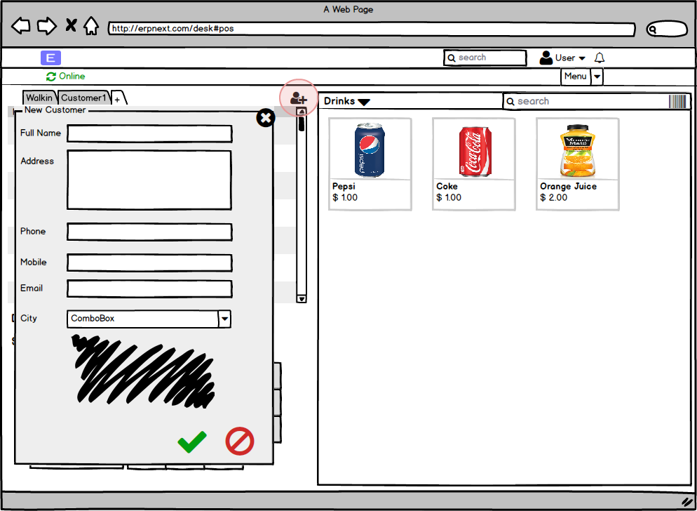
- the + used to search customer , and the add button is to quickly add new customer with minimum details.
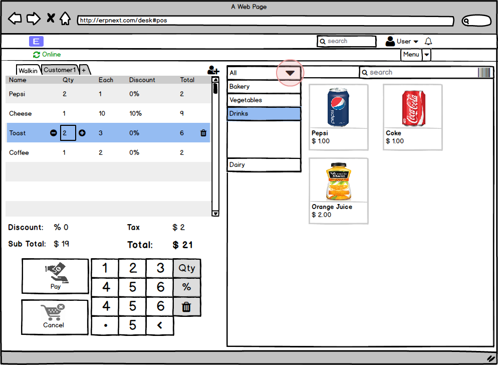
- we can organize the items based on categories
- Only selected item shows +/- and delete icon. and be active for the use with the number pad in the bottom. I think the number pad is essential especially for tablet user as we don’t want the keyboard poping every other second
4 - payment.
- the payment window slides in from left or bottom
- can easily choose mode of payment from left pane ( the also pave the way for multiple modes of payment)
- if the user click print or email without payment, then the system alert the user it will consider it as quotation.
- we have edit button to go back editing the cart ( or the user can also press the slid down arrow in the top of the payment window)
- after payment the user can choose to print email receipt the click done to close transaction and clear costumer.
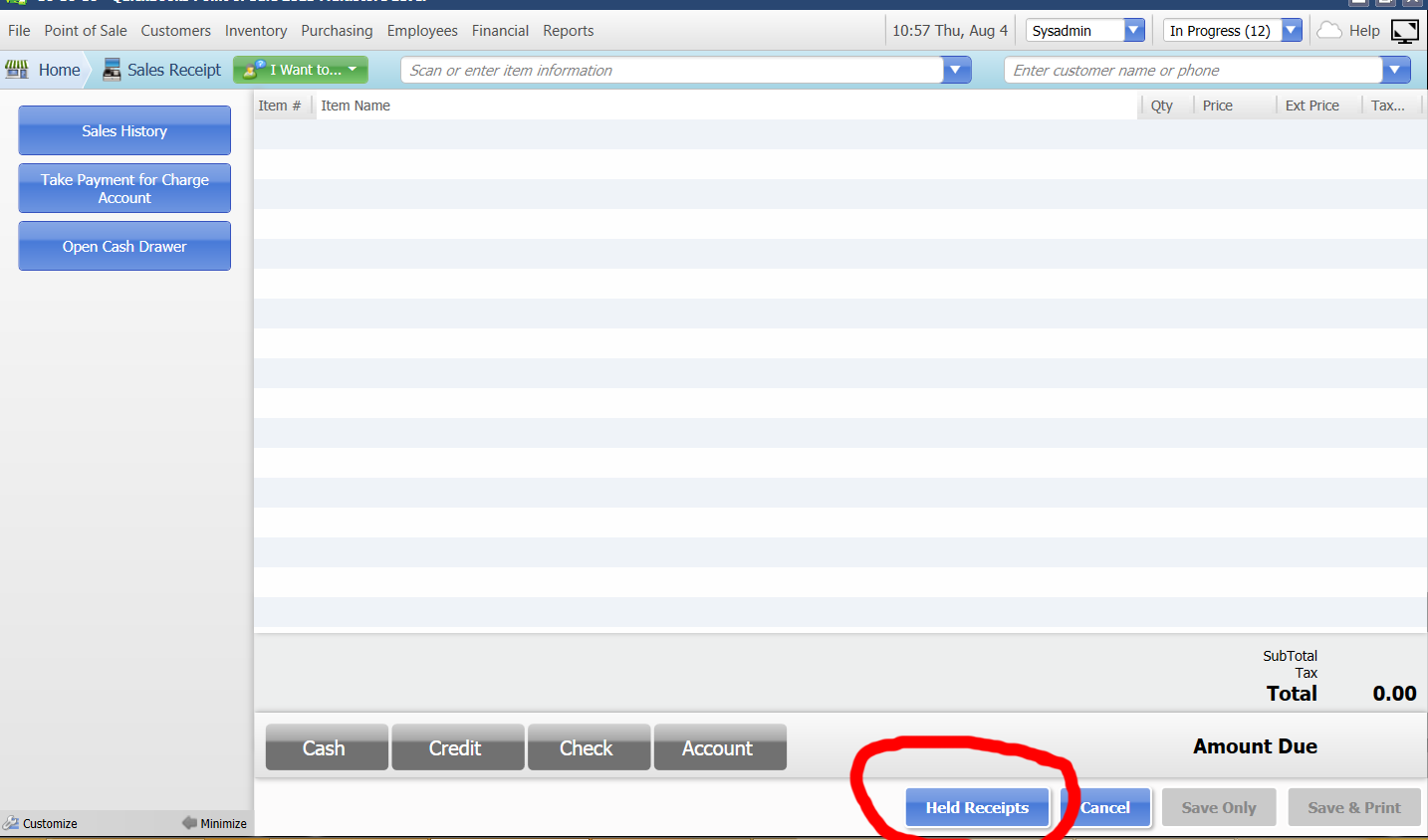
the quick add customer window is helpful. I also like the payment screen. I would not limit the customer tabs to 4 for example. I would probably make the tab called “held receipts” and when clicked have it list all of the held transactions where one can select one to “resume” the transaction.
You mean like drop down menu to show active costumers instead of tabs?
I thought tabs are easier to switch between costumers and in real world scenarios you wouldn’t have more than 2 or 3 costumers active at the same time
o, I mean having it be a tab called “held receipts” and then showing the open tabs. This would also require a “hold receipt” button to place the current transaction on hold. Once its clicked it goes to the “held receipts” tab, and a new transaction window opens cleared for the next customer. Once the other customer is ready to finalize the transaction you would click on held receipts, then select him and “unhold” the receipt to finalize the transaction.
In a real world you would easily have more than 2 or 3 customers at the same time. I myself with my current POS have 7 open. Imagine a restaurant for example there could be 10, 20, 30 or more and in other scenarios too.
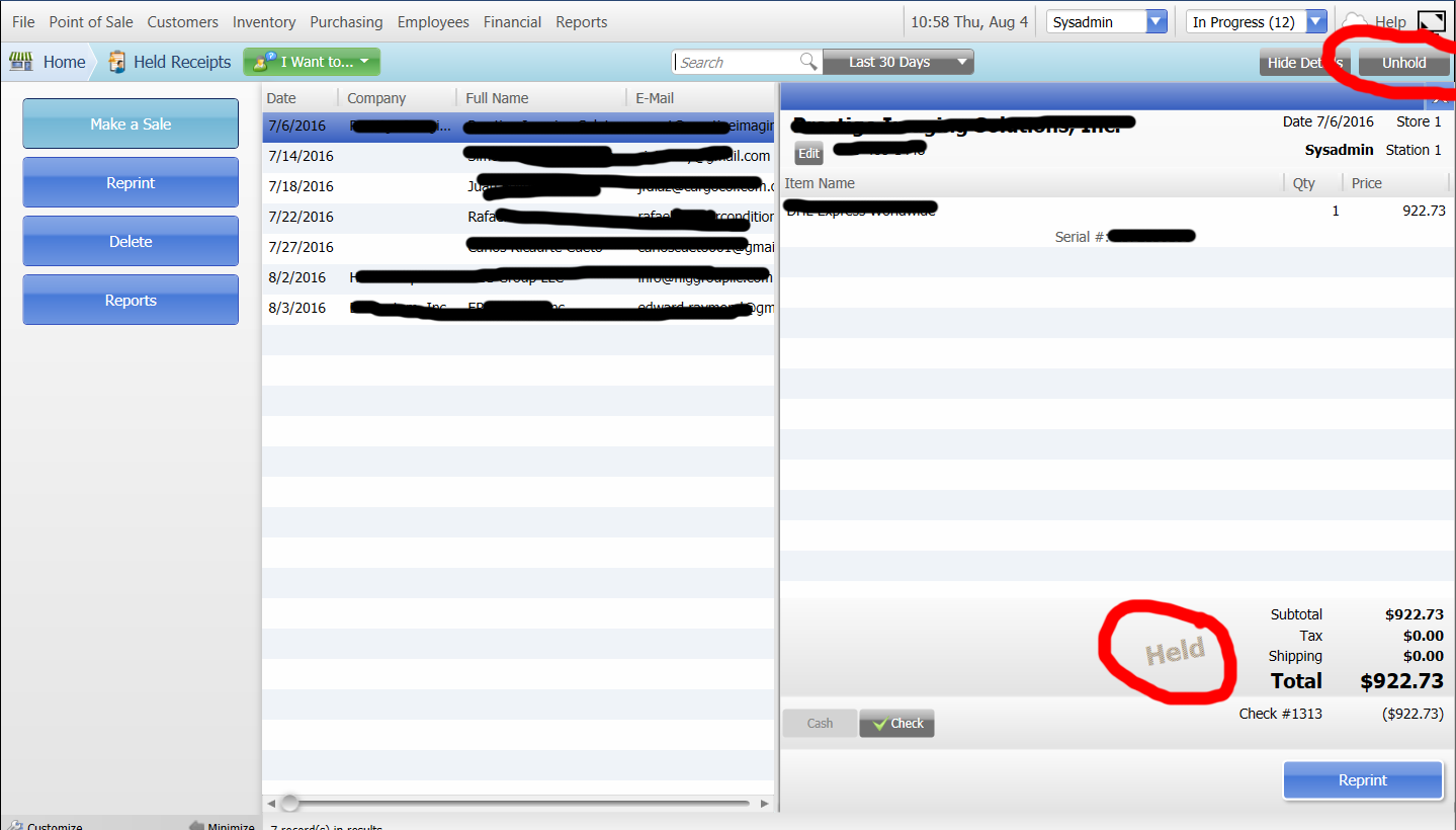
This is how its displayed in my current POS solution.
Thanks for your input. I’ll to include them in the design along with idea of her receipts.
For now I’ll work on designing the interface based on the inputs I get. Then i’ll put a prototype on invasion so we can get specific comments and usability test. After everything is agreed on I’ll post it up on bountysource.com and if anyone wanna help he can chip in on bounty source
Sorry for not updating this in a while. Here are is the design I came up with and looking for you inputs as I’ll finalize it and start a bounty to implement it. In the design the goal was touch screens first, so i avoided any typing or message boxes and notifications and used tab approach.
@ganas
Wow! Looks great!
I really like how you used the tabs approach. It looks much tidier.
I added some suggestions for modification to simplify it a bit and speed up the work flow.
I hope it doesn’t seem like I’m nagging because it looks like a lot of inputs. I really like your design and I would really like to see it in ERPNext!
Customers:
Merge the “Serving” and the “Customers” button: The Costumer-button would show who is been served at the moment. If you click on it, the “Customers” screen is shown.
Put the active customer also in the queue-list and make the active customer highlighted.
Then get rid of the “select” button (arrow) in the list. Instead you could just click anywhere on the customer to select it as active.
Put the “delete” button on the very right of every customer row, deleting on accident would happen less.
Get rid of the “delete” button on the “Serving” button because it is already on every Customer row.
Add a new Customer:
On a tablet you would use a screen keyboard. This would cover most of the form. Maybe it would be better to have a “New” button by the search field and then use the whole screen for the form+keyboard.
Cart:
I can see the idea of the sliders but I honestly think you would be much faster with a traditional POS number keyboard, also on a touch screen! Think about it:
A customer buys two cokes: You press “2” “x” “coke”
You want to give the customer 15% off: “1” “5” “-%”
You want to gibe the customer 2.00 off (this possibility is missing): “2” “00” “-”
You want to change the amount of a previous item: select the item and use the number keyboard.
Fiddling a slider to the correct number is less practical!
I would put a traditional POS number keyboard with “00”, “x”, “-”, “-%” and “delete” buttons
Instead of the “x” as delete button I would use the “garbage” button for consistency.
You also need a possibility to give discount to the whole and to part of the cart. The traditional way is a “subtotal” button but maybe there is a better idea.
Isn’t there a better possibility then a dropdown list to select a category on a touch screen? (I don’t have a better idea either.)
Payment and Summary
I really like the Paymernt-tab! Simple and efficient!
I would add a “00” button to the number keyboard. Entering 100.00 is much faster with it.
But is the Summary-tab really needed? Couldn’t you just add a big “Finish” button to the Payment-tab which does a predefined process (like printing the receipt).
You could also put some smaller buttons to do different things (like send the receipt by email or delivering everything by mail). If you then need more information (like the email-address), you could be send to the Customer-tab or an other tab would be opened which asks for the missing information.
Thanks those are really valuable inputs I agree with most of them and will update the design.
Just this part, would you mind explaining more?
I used the sliders in the cart because you can simply fetch the available quantity and maximum discount allowed for the employee and set them for slider limits so you don’t get annoying notification when quantity not available or exceed allowed discount. Also you can easy integrate the price list rules with the sliders so available discount on the slider will be updated based on qty. Anyway we can drop them for traditional POS number keyboard
Of course:
A great thing about your design is the lack of scrolling. Everything is always visible.
The “new customer” form is the only place where that is not true:
Every on-screen keyboard I could find on Google Play uses the full width of the screen and more or less half of the hight. For your design this has the consequence that everything lower than the “Billing Address”-title would be covered and you’d have to scroll down.
To avoid that you’d have to use only the top half of the screen for the form. To insert it into your current design I thought a “New” button which opened an overlay form using the full width of the screen would be an answer to that. But I can see now that you wanted to avoid overlays. So it’s overlay vs scrolling… But maybe you have a better idea.
I hope my explanation makes more sense now.
By the way: If you get rid of new customer form on the right side you get free space for other things. For example valuable informations about the selected customer: recent history (“by the way we have a new add on for your…”), next birthday, family members… (Could be something to think about for a next release.)
Hm… I see your point now and I see the benefit of it but I honestly think there has to be a faster way for the cashier. Maybe its enough to just write down the max discount next to the discount button. If they put more then allowed they get a sound and the max discount turns red or something…