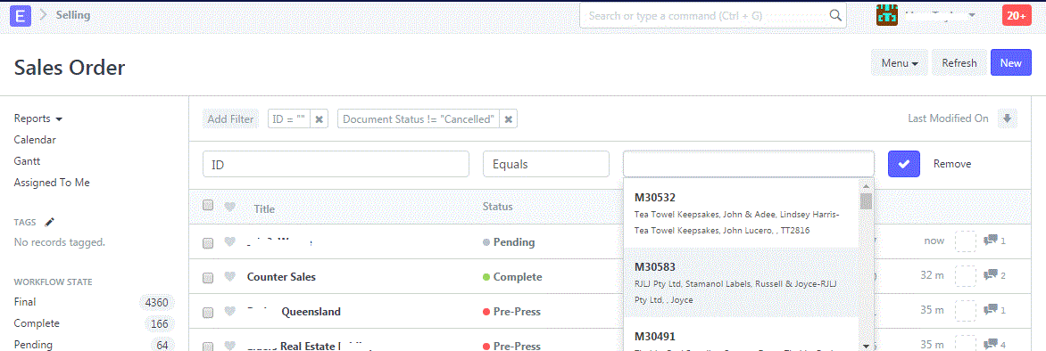
Recently we have had a problem appear first on a single PC about 2 weeks ago but now it’s the same on all the PCs running Chrome accessing ERPNext. When you use the ID field search function, instead of being easily readable and “solid” as it was previously:
The formatting is now different (harder to read as text doesn’t line up, etc) and the actual records displayed are “transparent”. If you click on anything other than the SO number (M11111) it selects the listing “underneath” and opens that SO. It’s hard to describe but this is a screenshot:
This is making searching for previous records difficult and slow and is affecting all of our doctypes.
Has anything changed recently in v7 which might have caused this? Given Chrome was OK on some workstations but now all are affected it appears a change in the system which isn’t compatible with a later Chrome update might have caused this?
More importantly is there anything I can do to fix - other than swapping browsers as Chrome is our standard and works really well with ERPNext apart from this one problem.

